
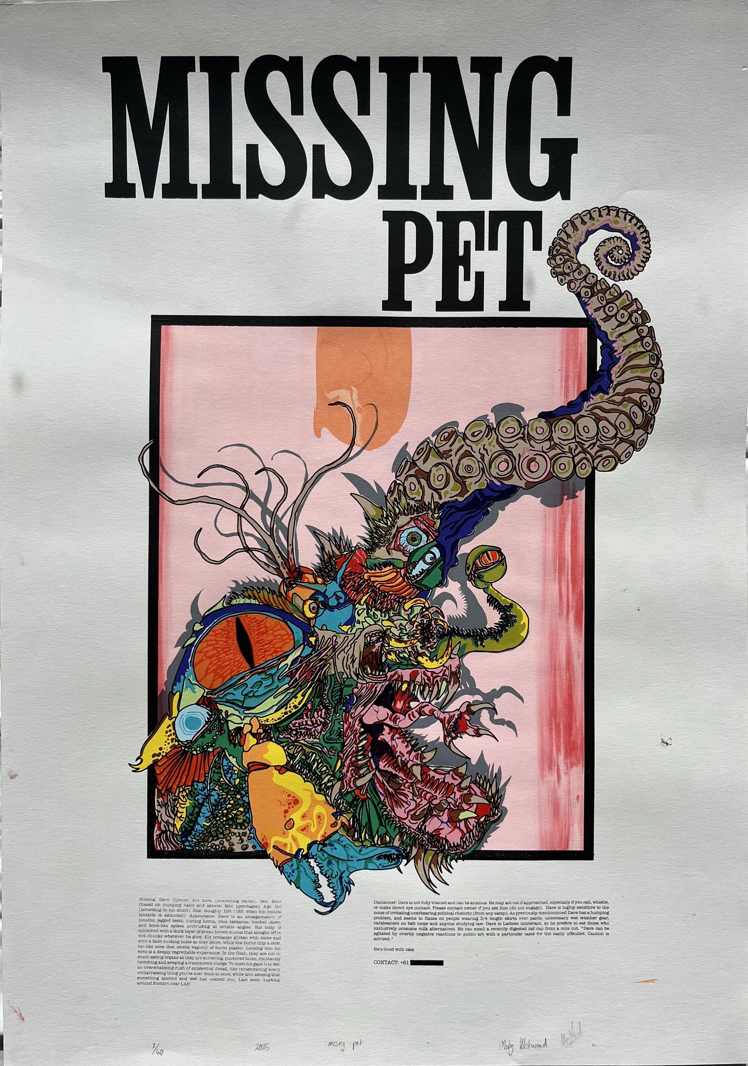
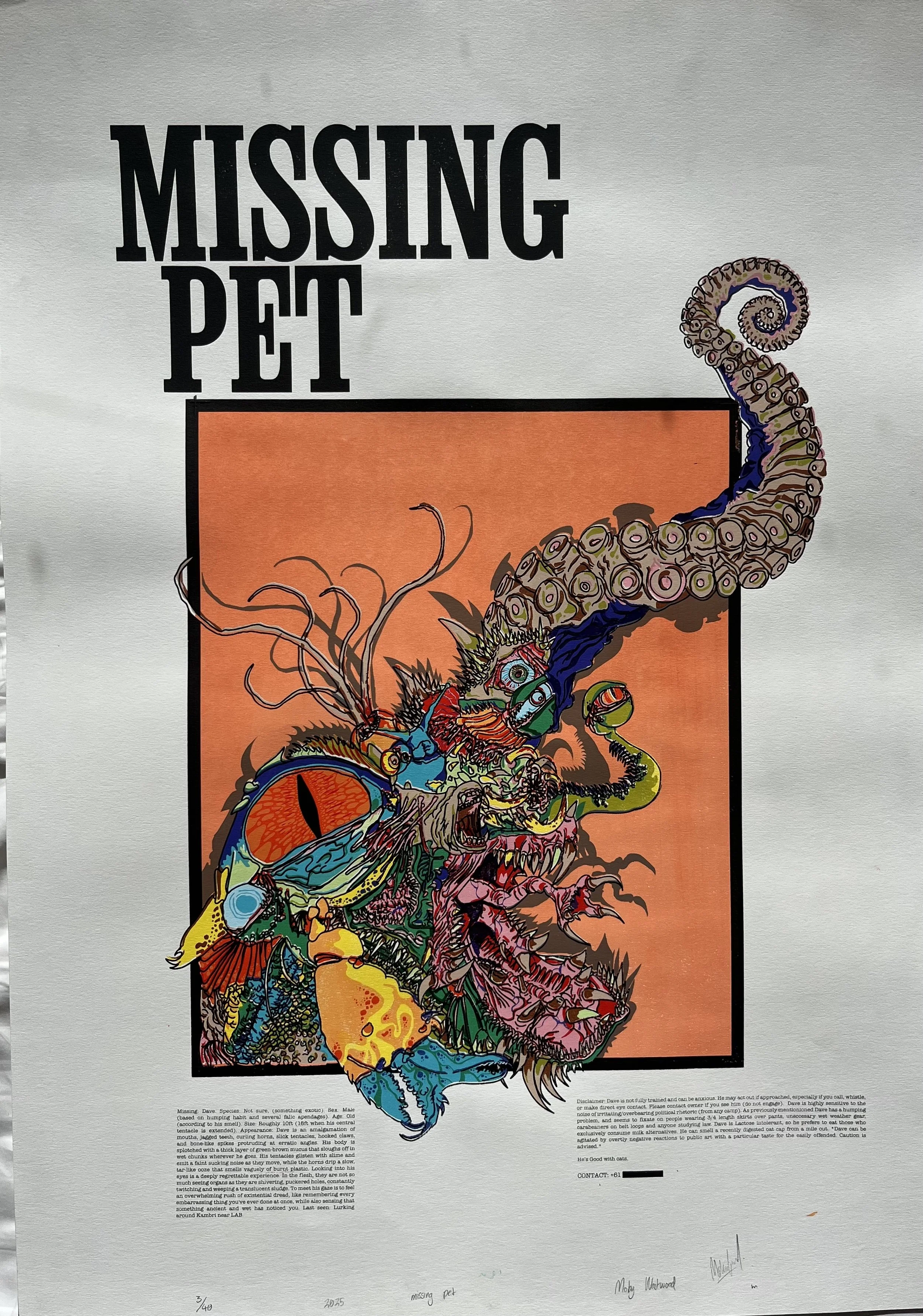
Dave
Year: 2025

Project Brief
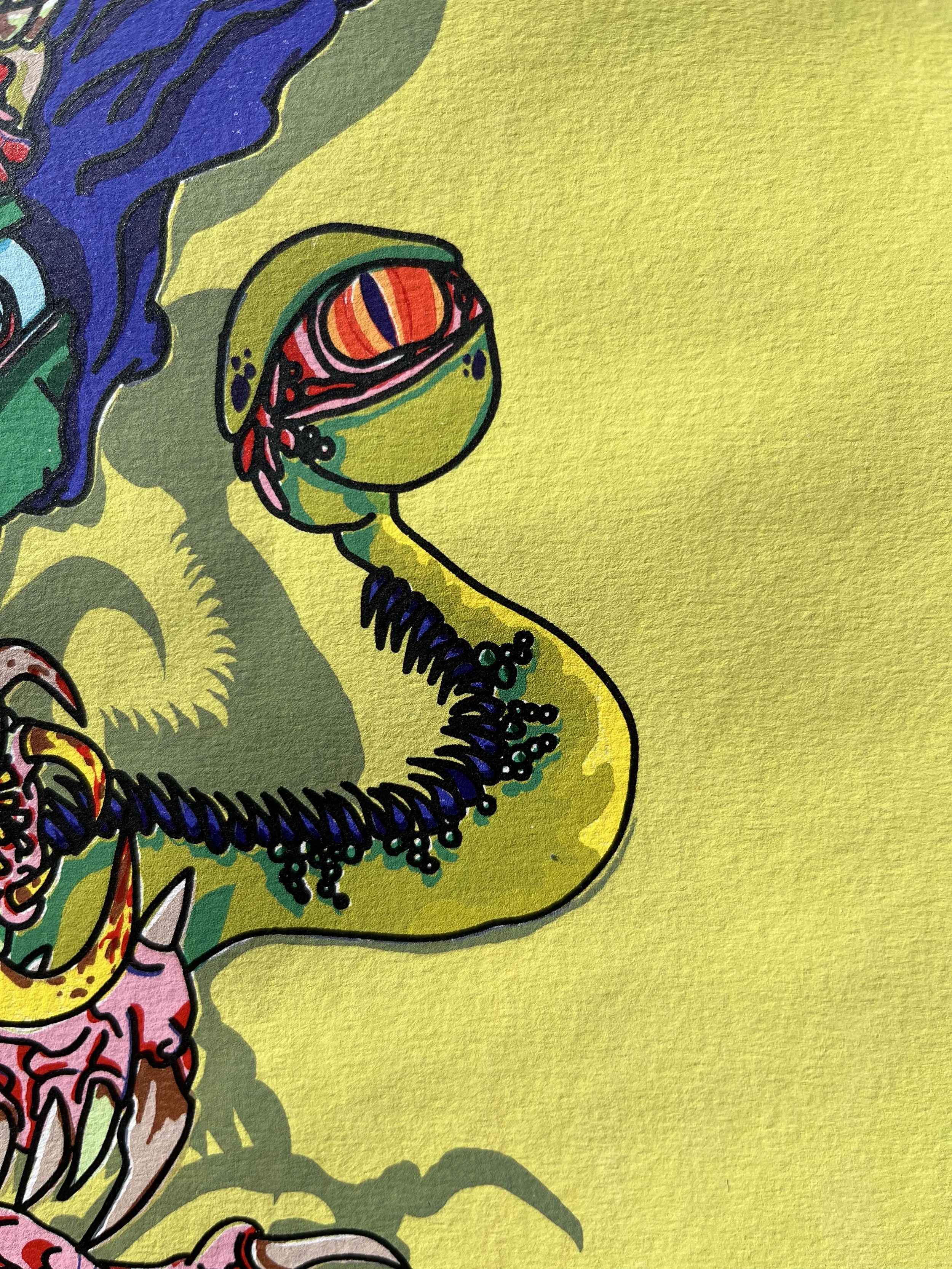
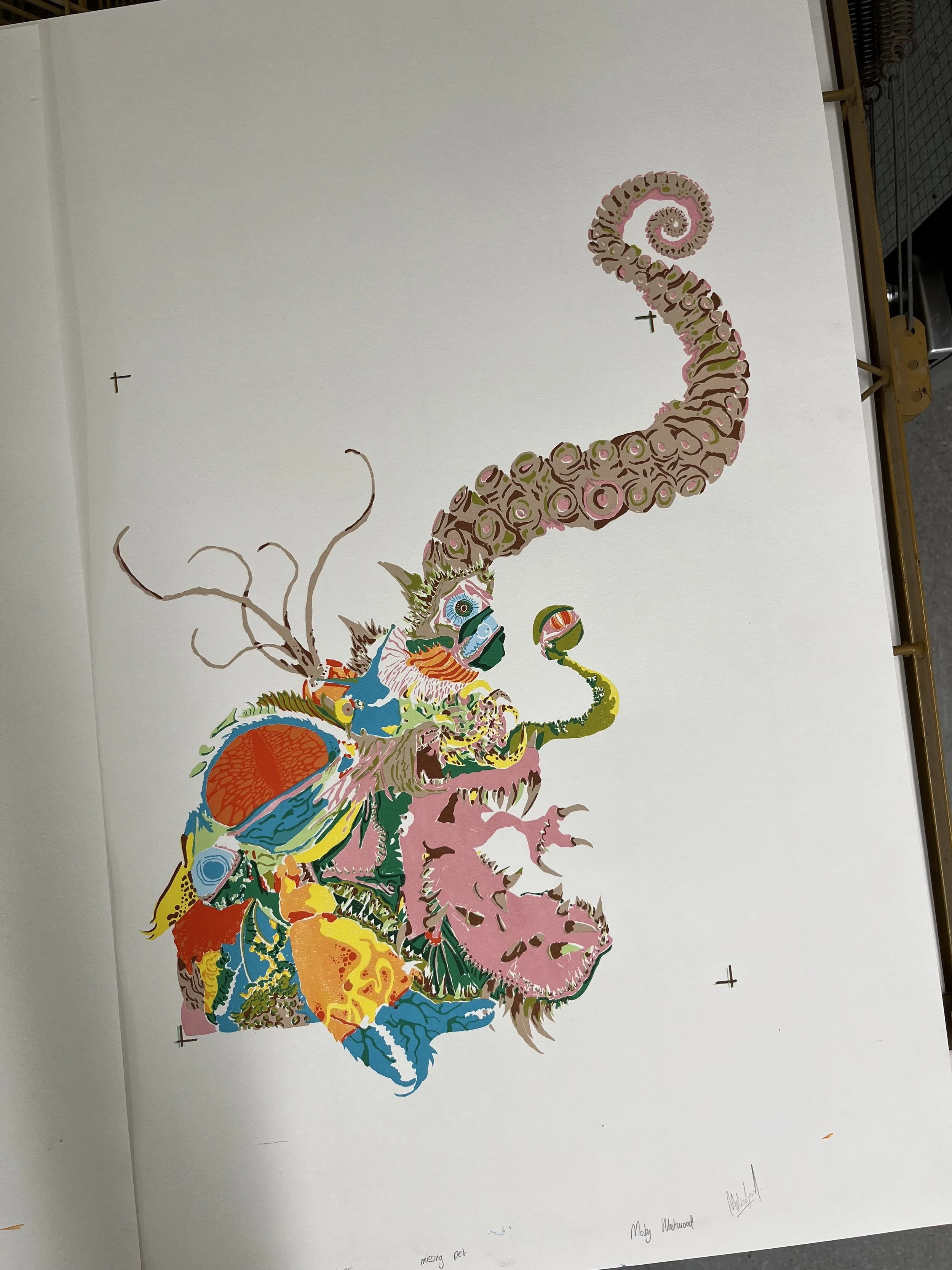
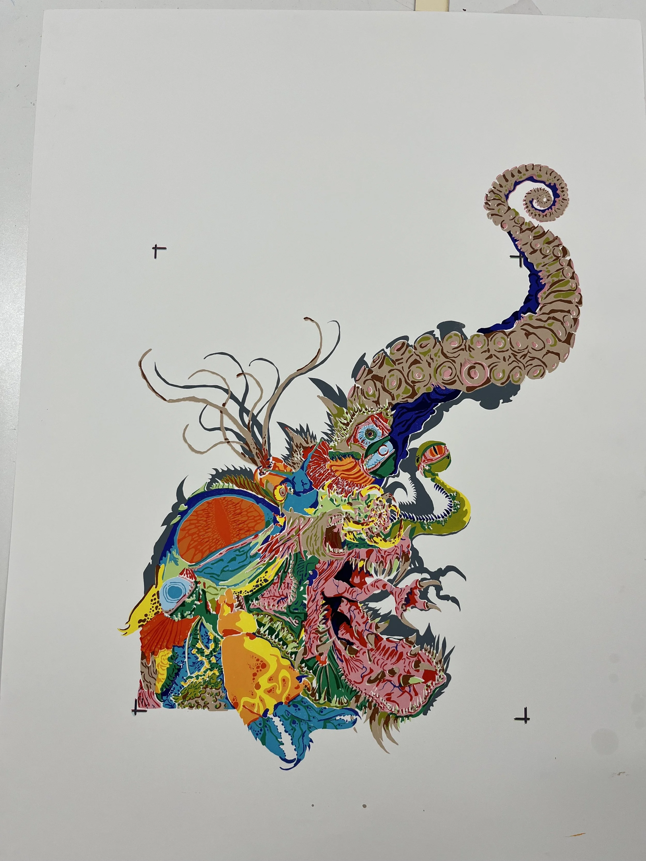
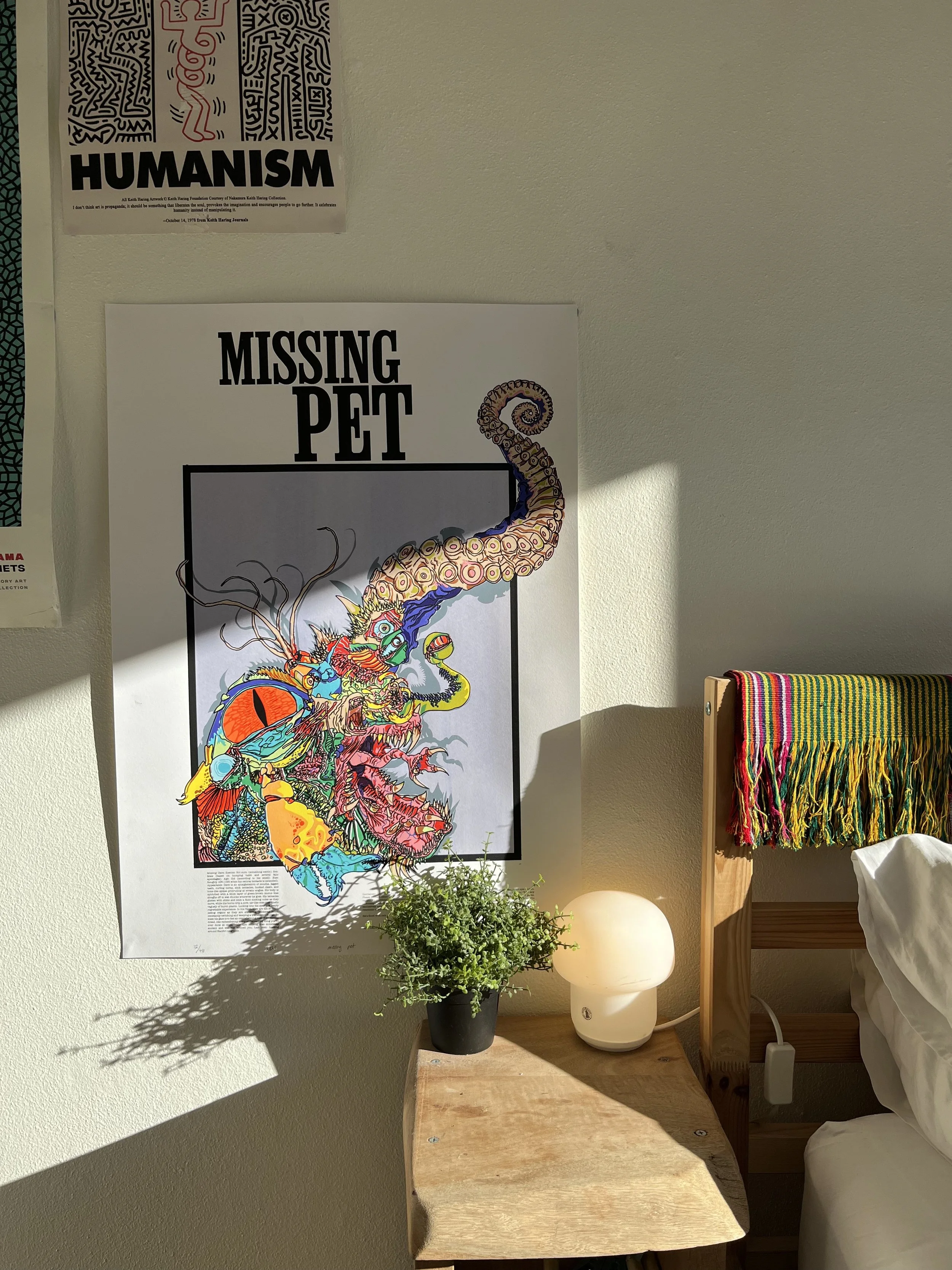
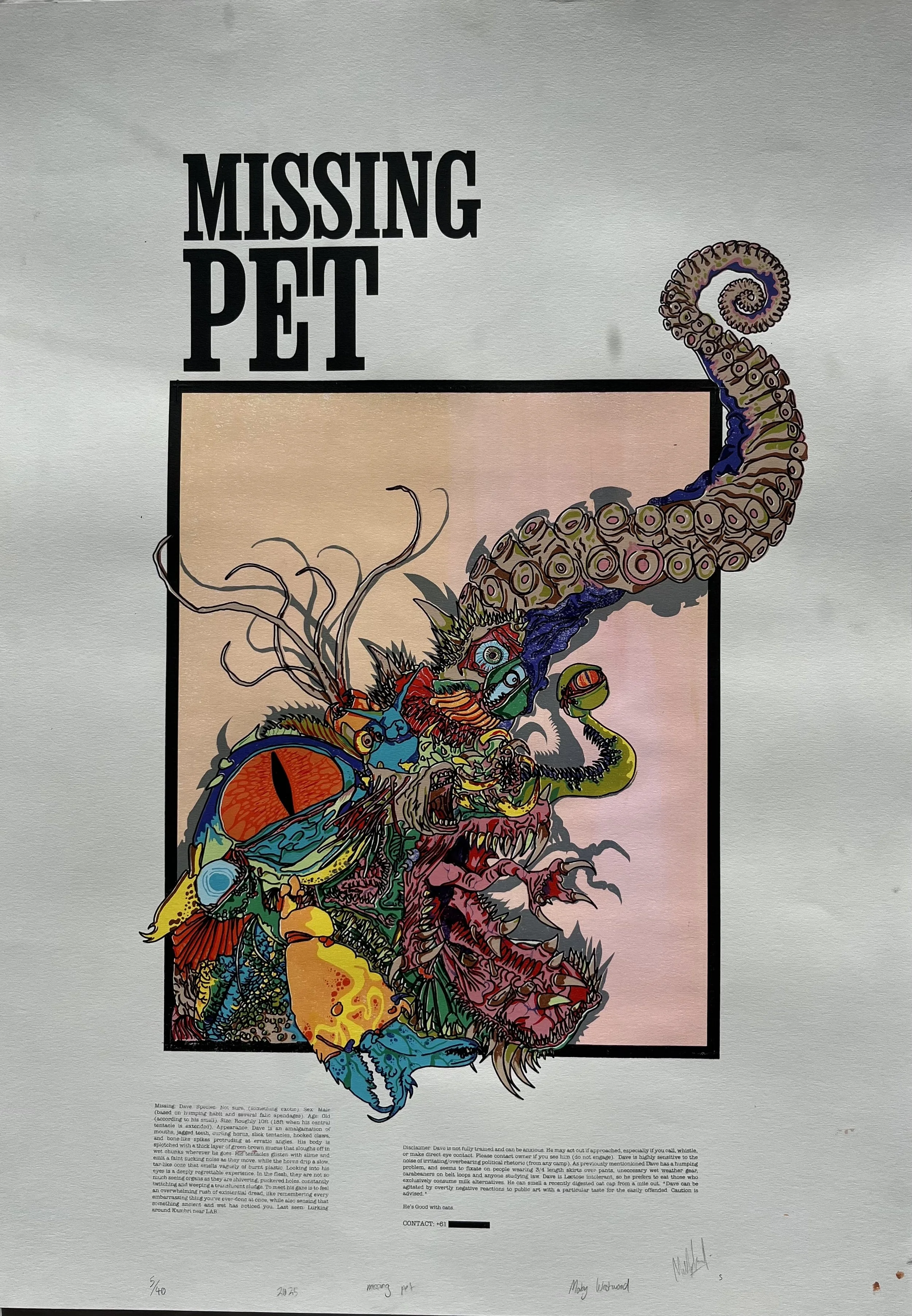
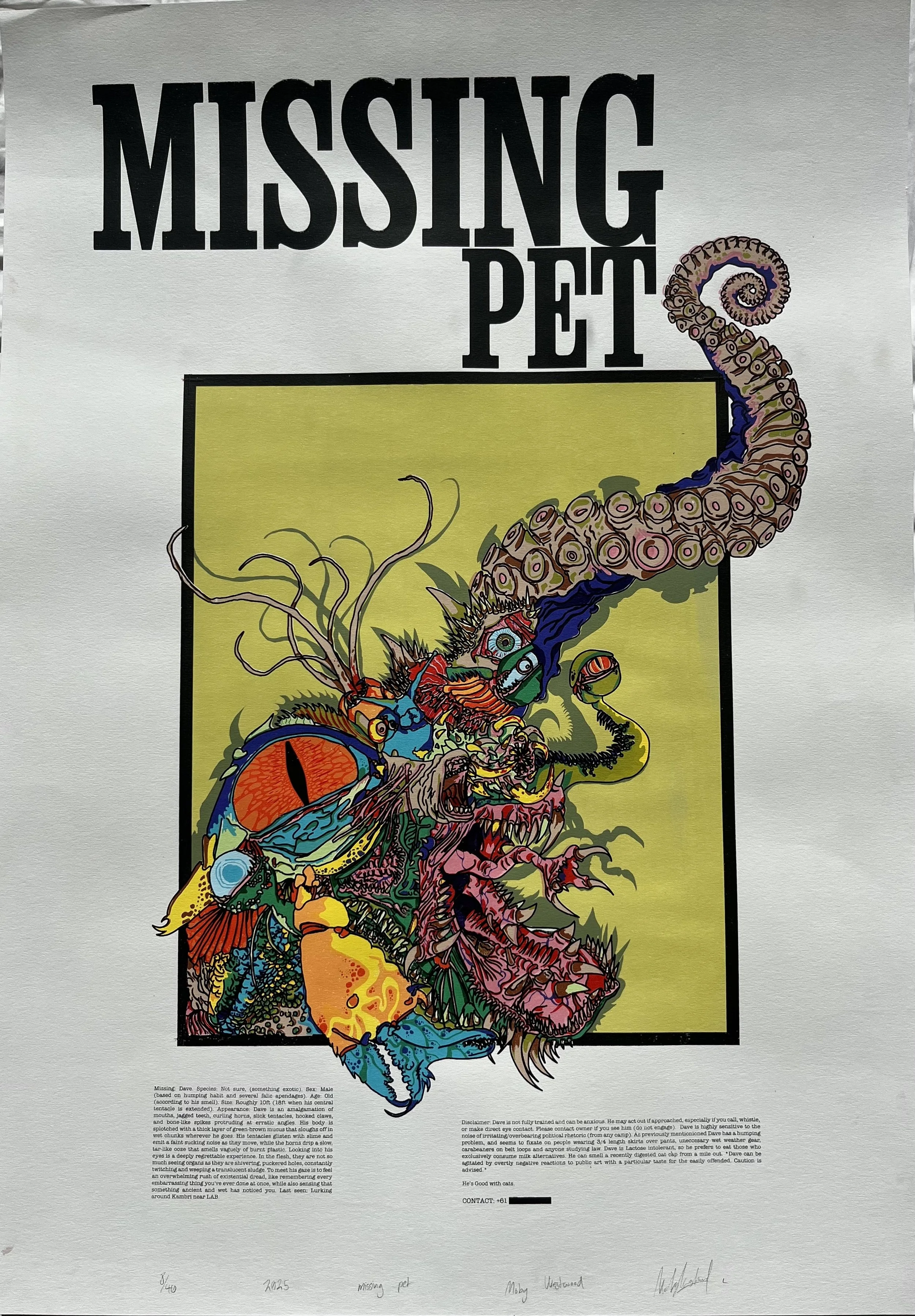
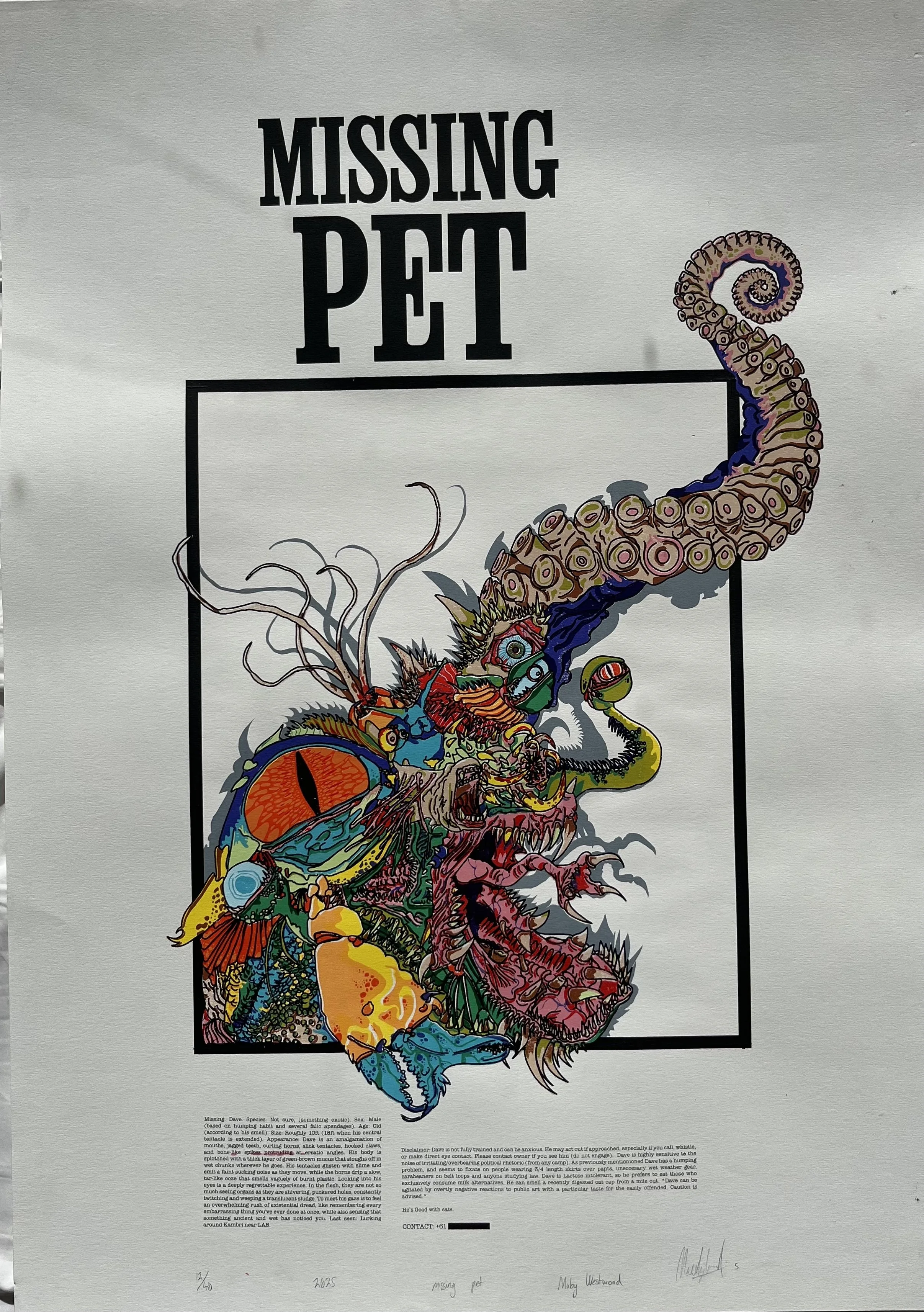
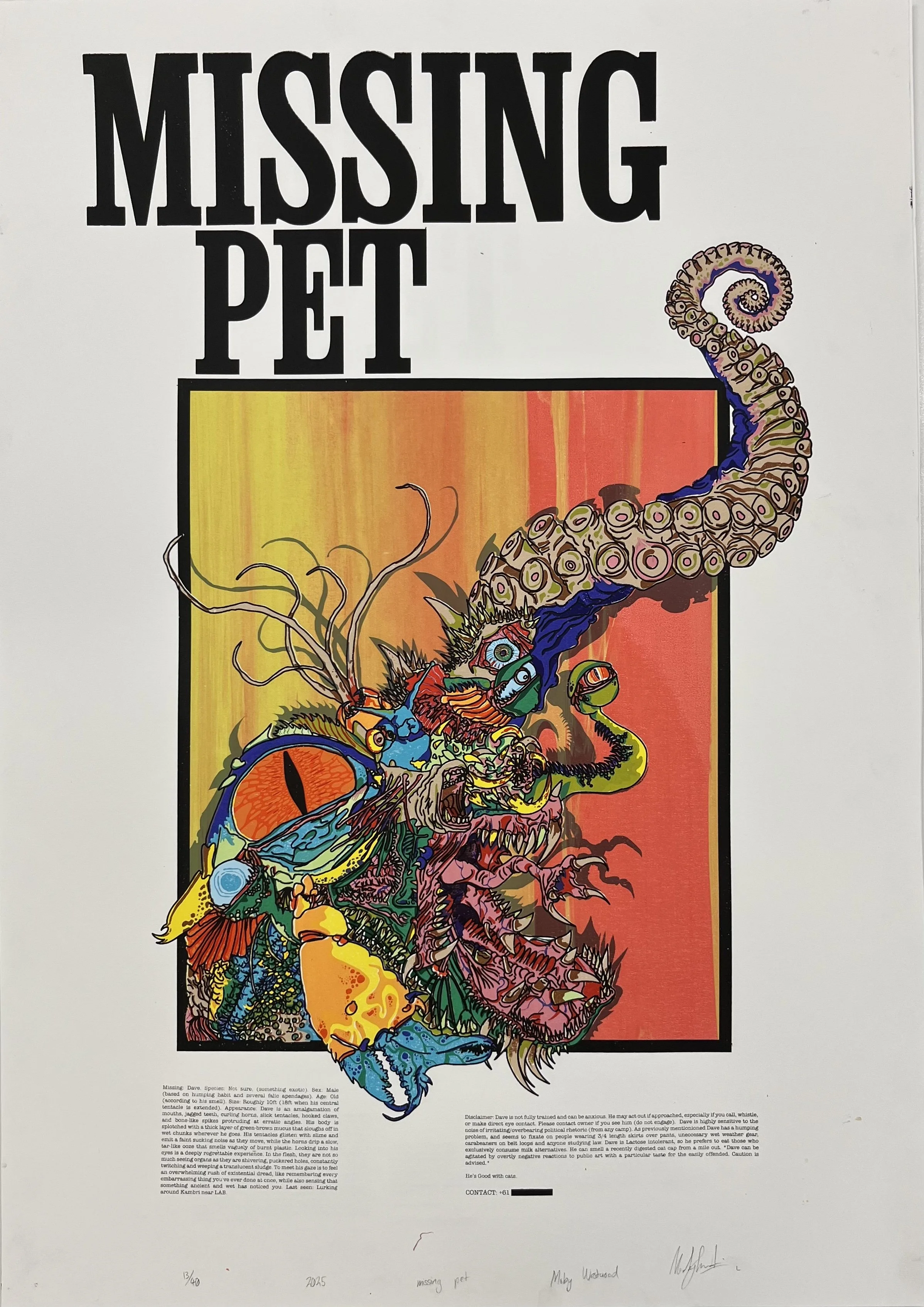
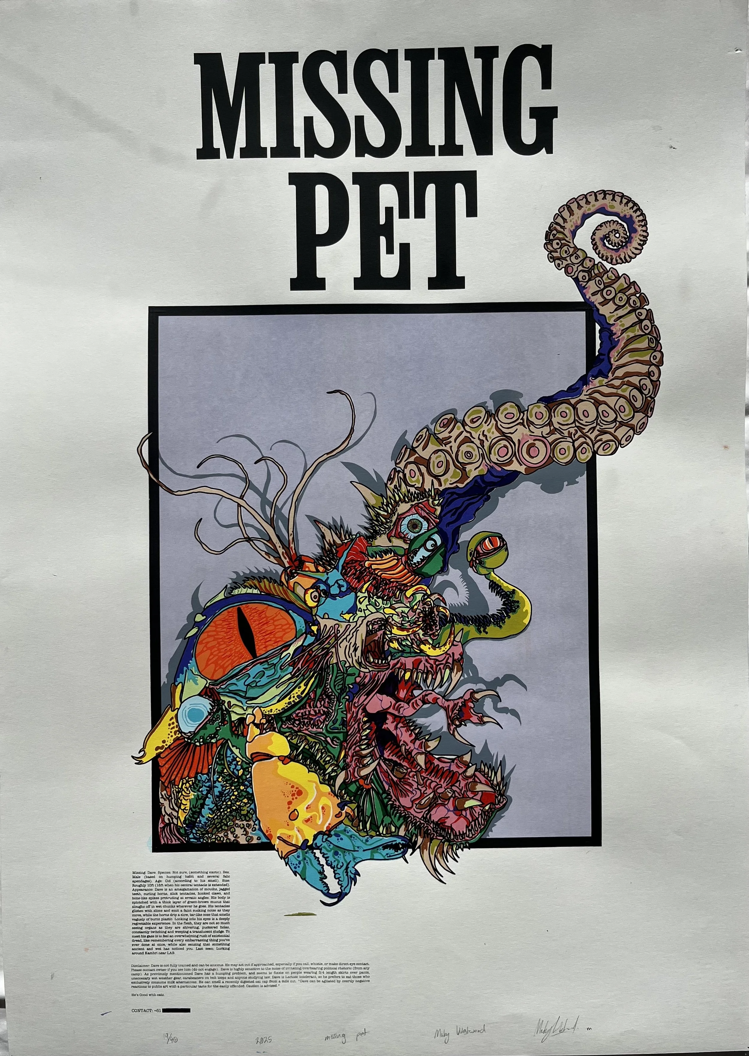
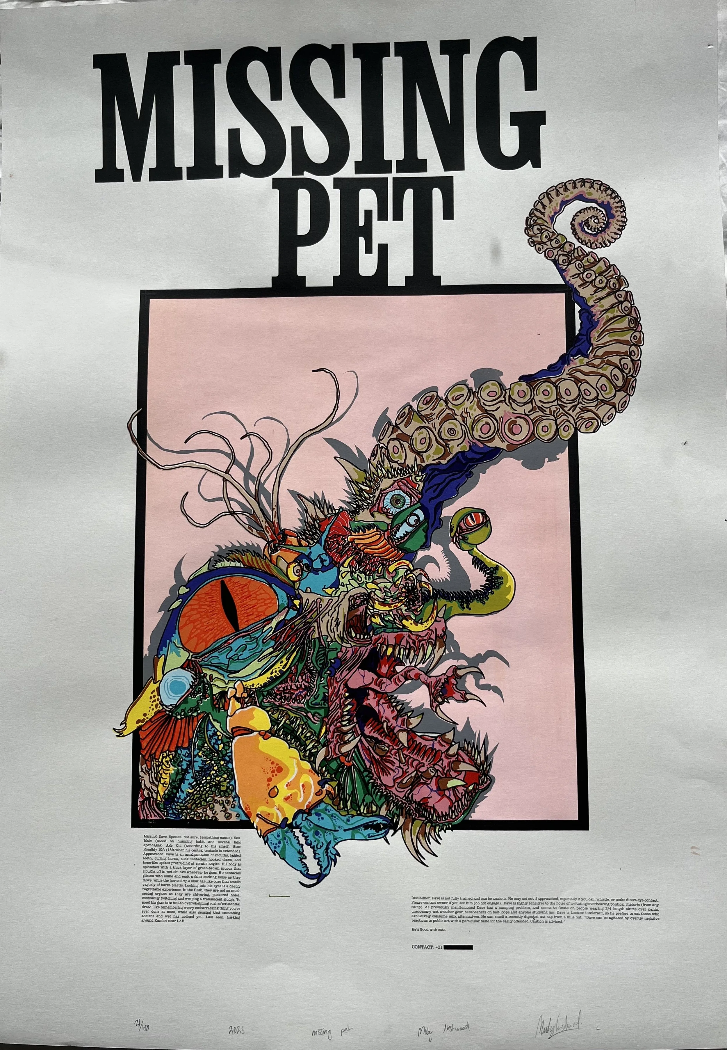
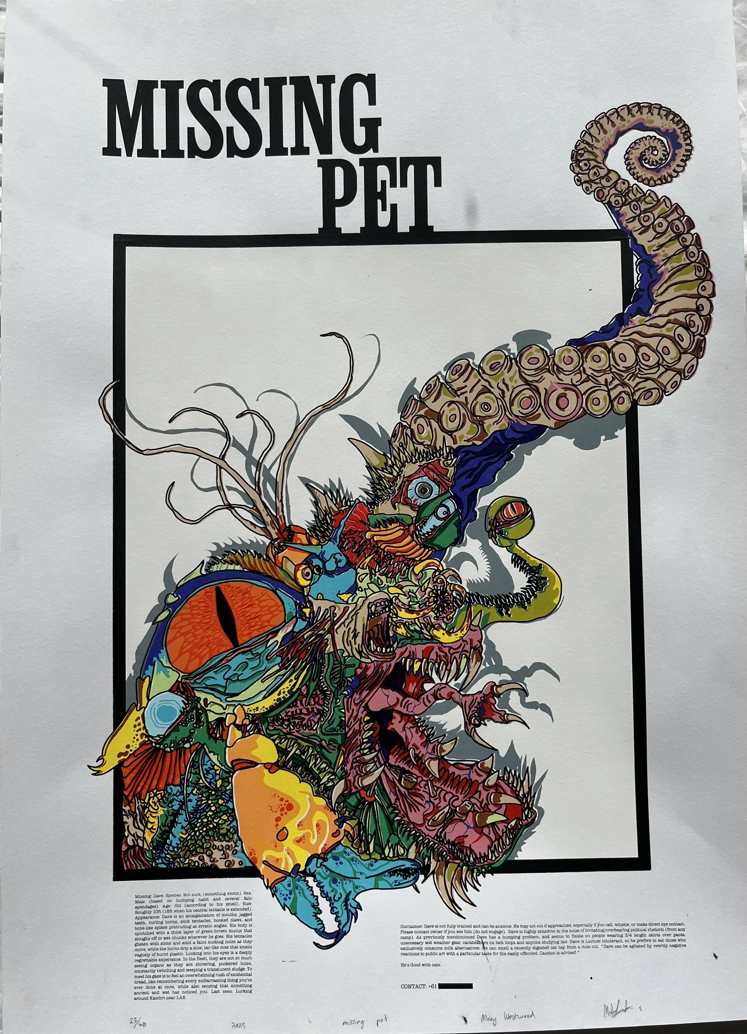
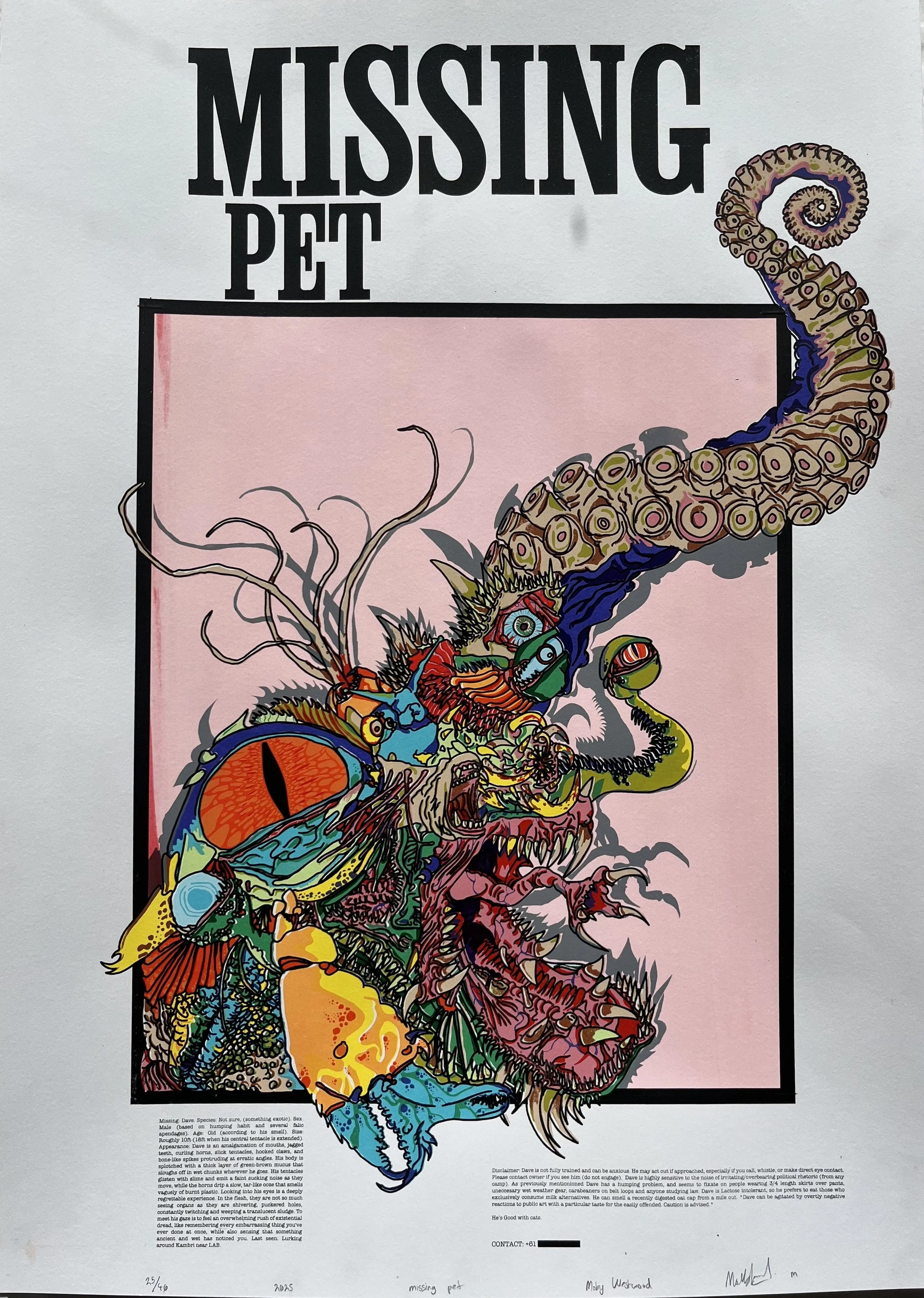
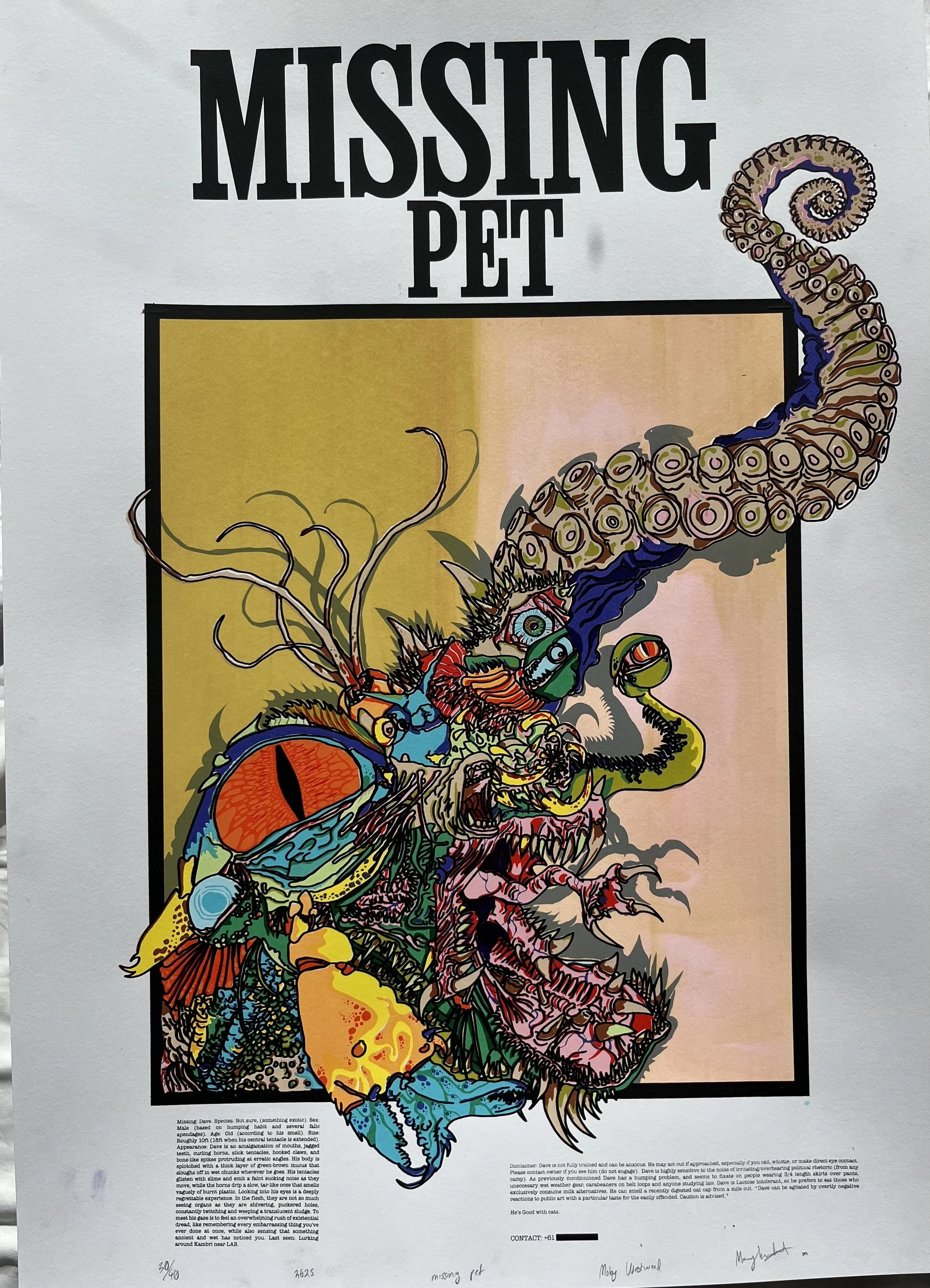
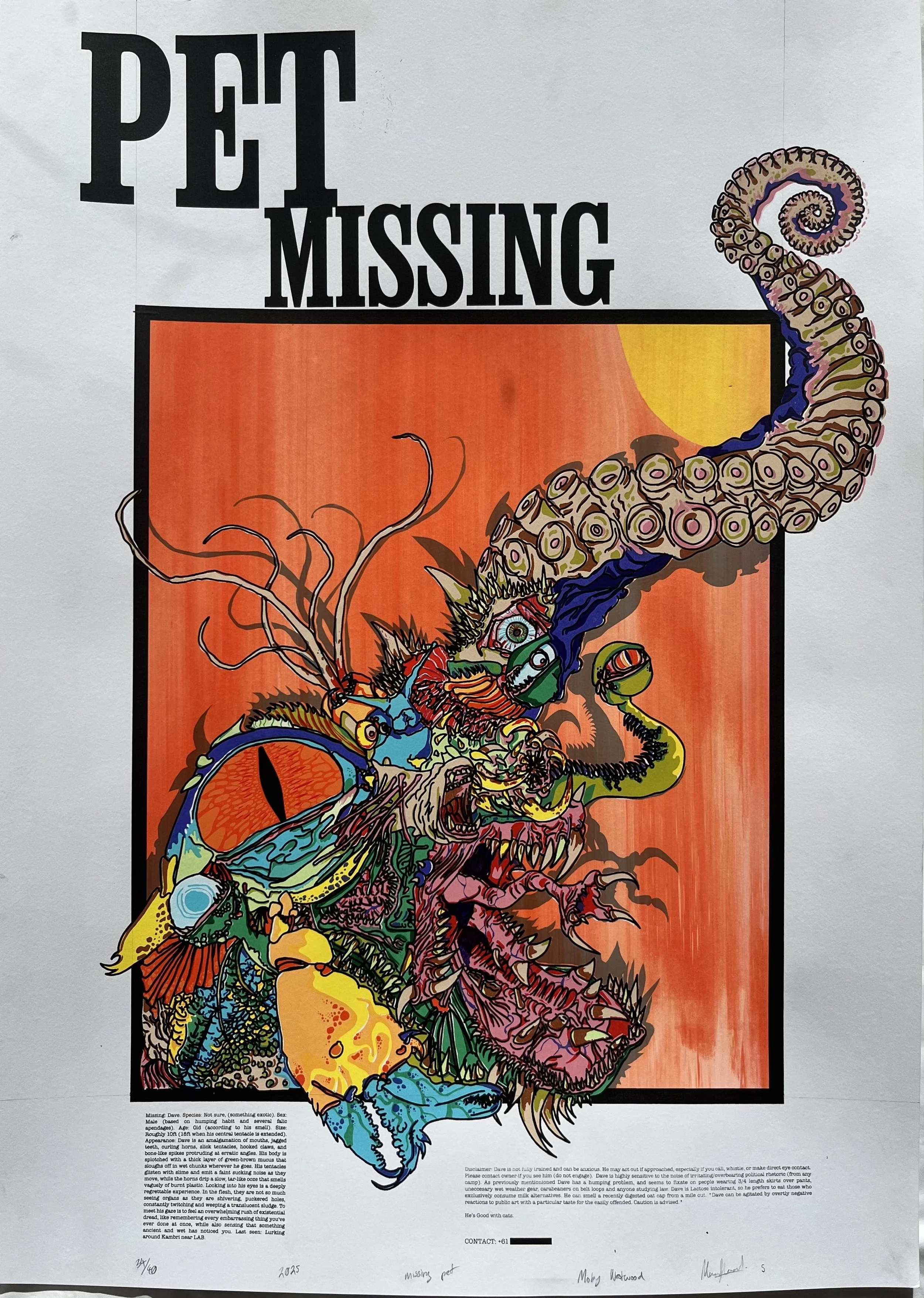
Dave is a satirical screen-printed poster series created in response to the culture and character of the Australian National University (ANU) campus. The work borrows the familiar format of a missing pet notice and pushes it to absurd extremes through the invention of a grotesque fictional creature. It plays with ideas of identity, self-awareness, and the human capacity for humour. Drawing on campus stereotypes, from oat milk drinkers to carabiner wearers, Dave functions as a metaphorical test of whether someone can recognise their own ridiculousness and laugh anyway.
The project combines bold colours, flat graphic forms, and layered screen print textures with hand-painted detail. These visual strategies highlight both the absurdity and polish of the work, mirroring the tension between sincerity and satire that drives the piece.
The outcome is a striking, concept-driven work that uses humour and horror to reflect on campus life and the quiet dignity that comes with being able to take a joke.


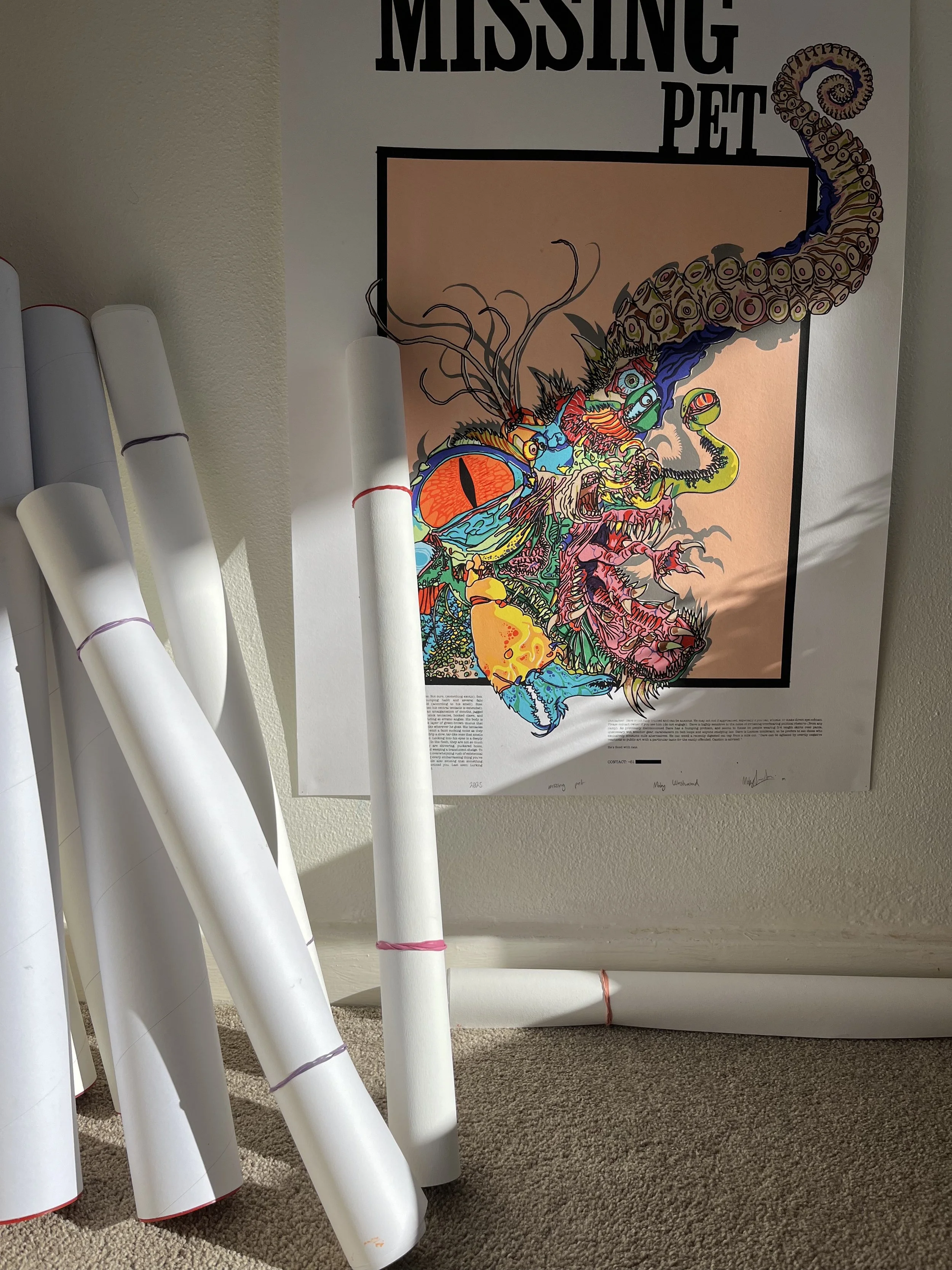
Description: Screenprint, 23 layers, acrylic paint on paper, 594mm x 841mm (A1) & 500mm x 700mm, ed. 1-40.
Artist statement: What makes someone good? We often associate goodness with charity, loyalty, or moral conviction, and fair enough. But those things are slippery, often tangled up in performance or circumstance. What marks a good person, I think, is their ability to laugh at themselves. To recognise that everything they do - every bizarre outfit choice, every oat cap, every unsolicited political opinion- is at some level, deeply ridiculous and still carry on unbothered. Dave exists to test that. A revolting and terrifying yet unequivocally fictional creature that feeds on those who most perfectly embody the local stereotype (ANU campus).


Process
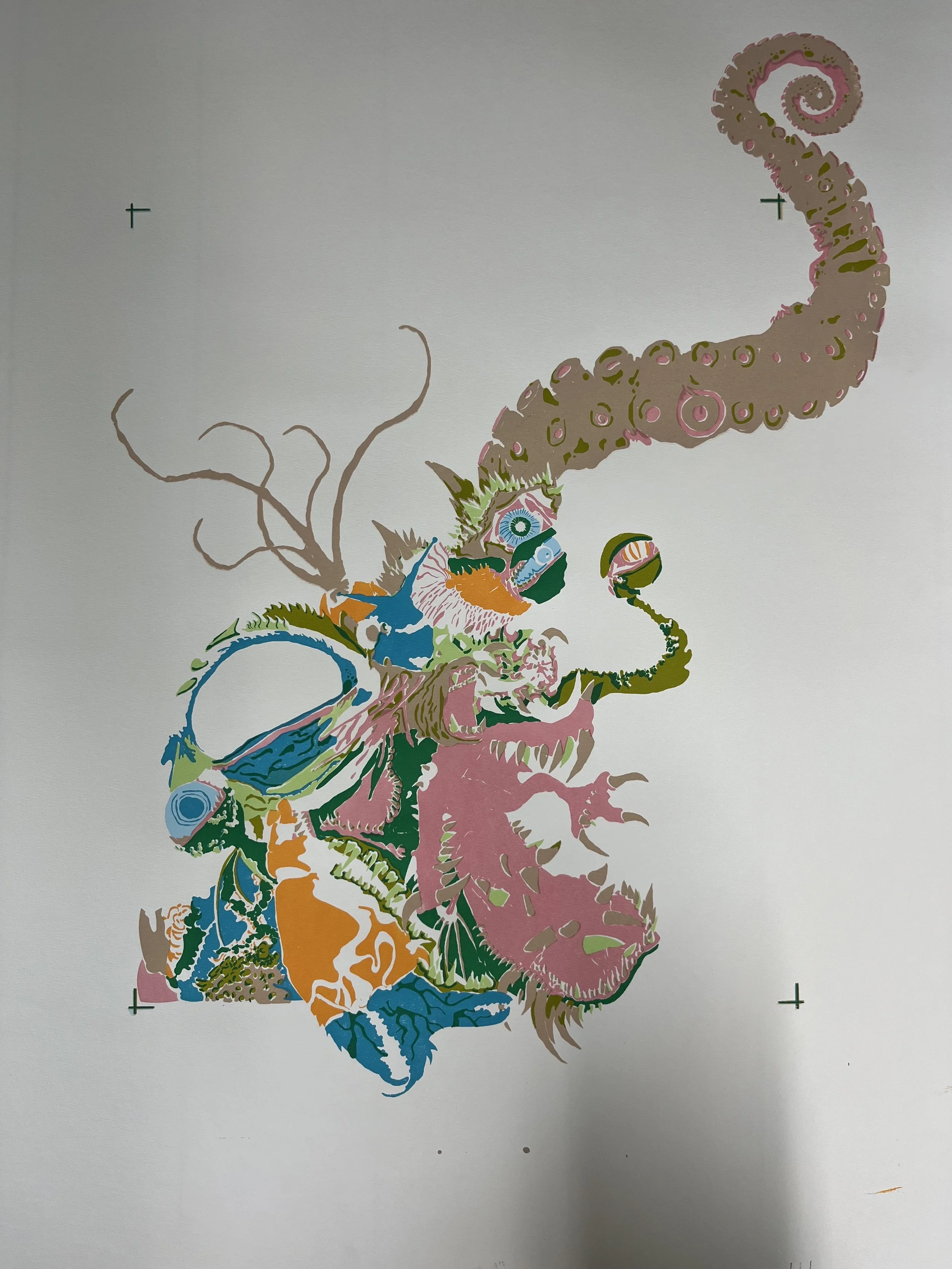
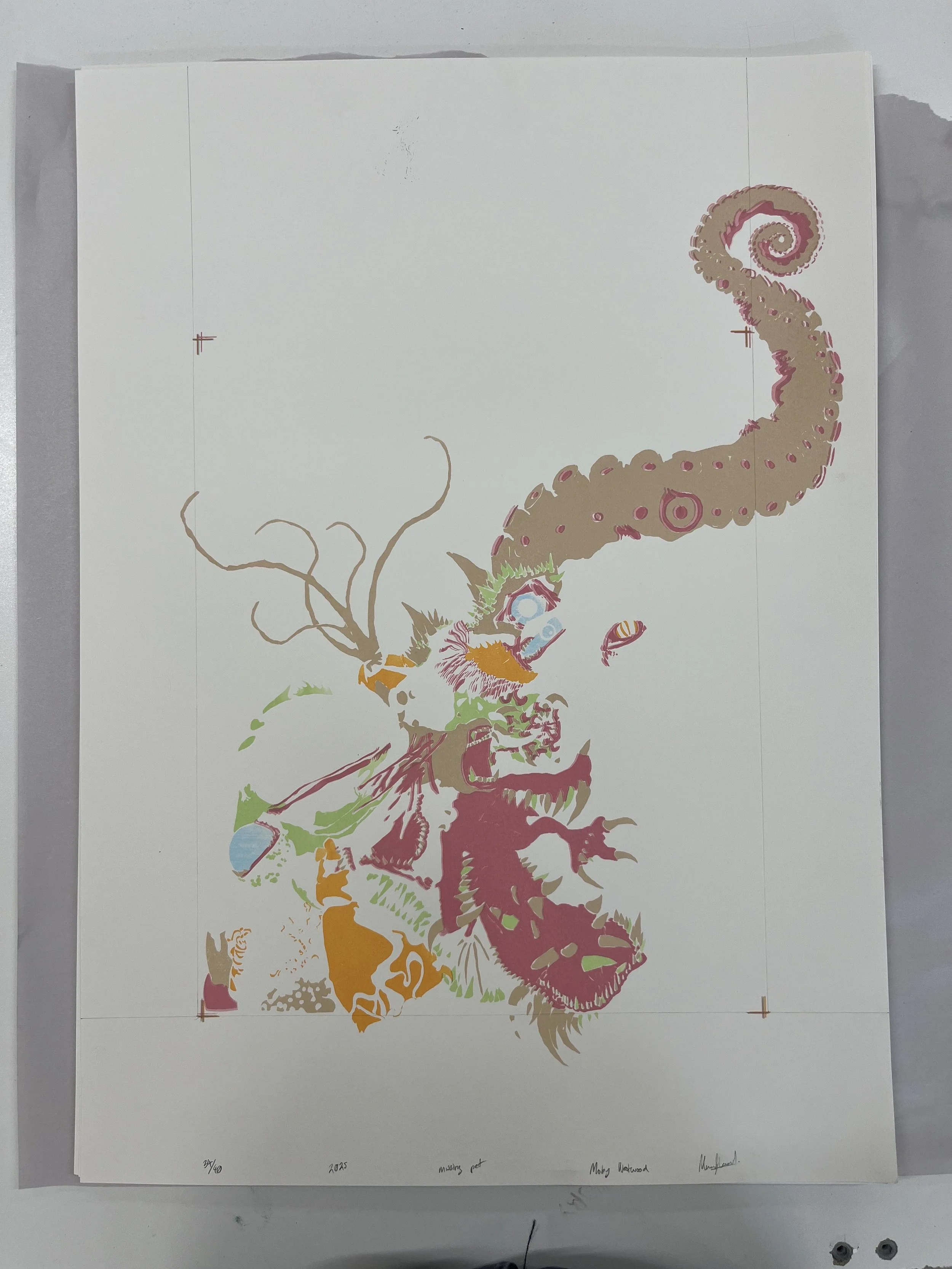
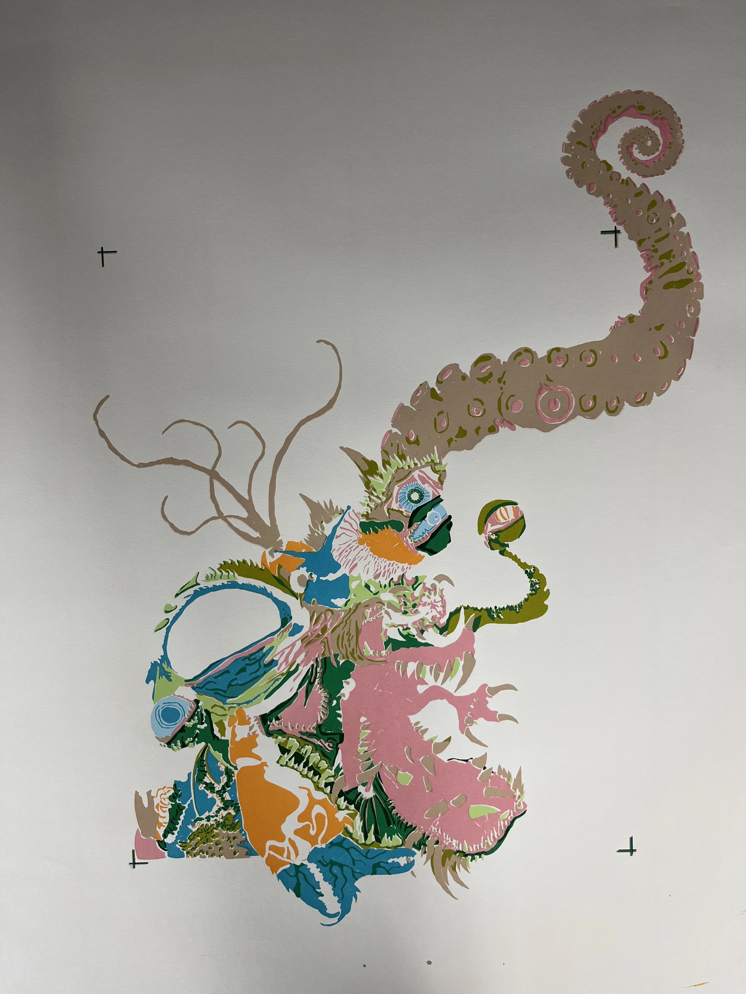
The creation of Dave began with loose conceptual sketches that explored the format of missing pet posters and how this everyday medium could be exaggerated into something both unsettling and comedic. I developed the creature’s features—tentacles, oozing horns, and vacant eyes—as distorted reflections of familiar campus archetypes pushed to monstrous extremes.
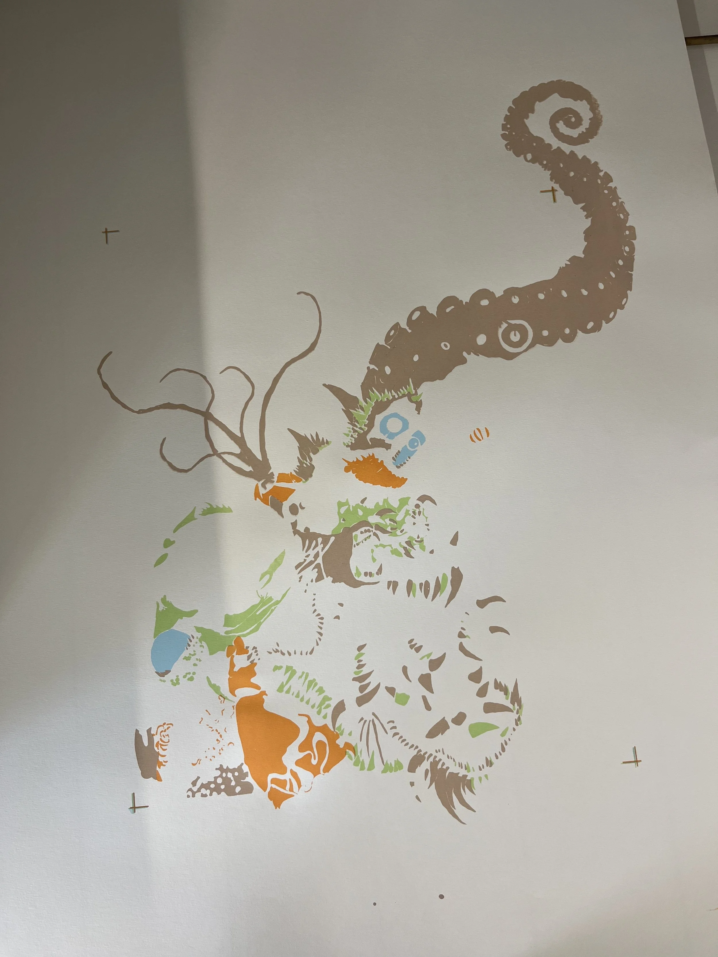
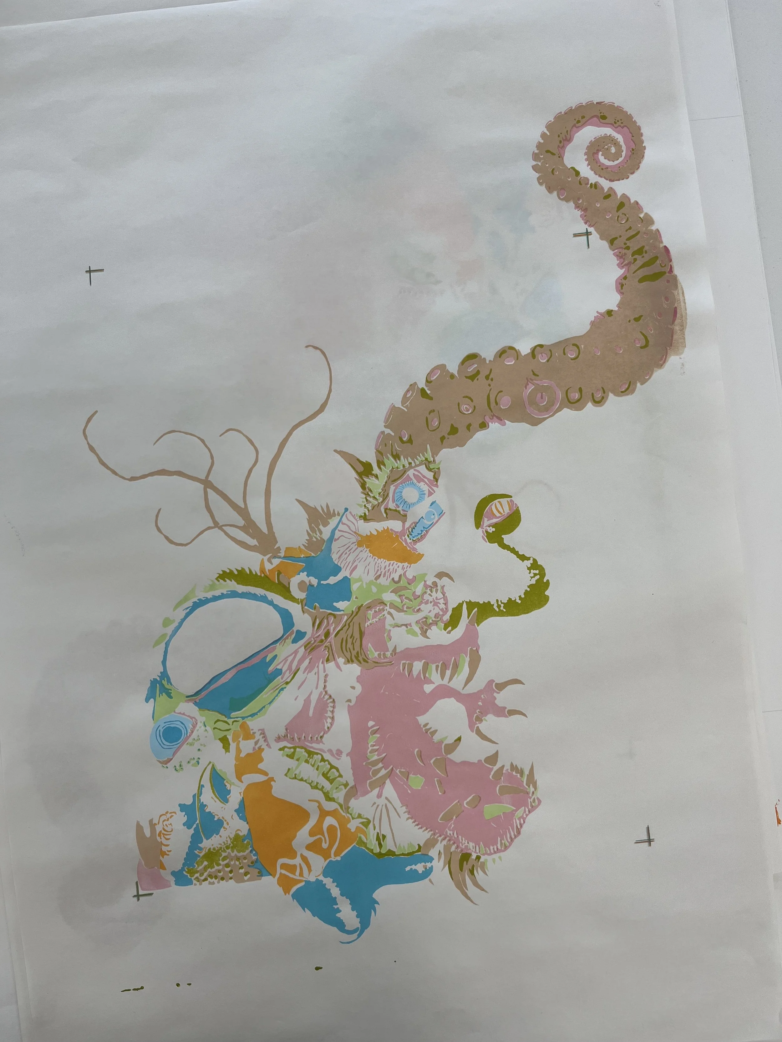
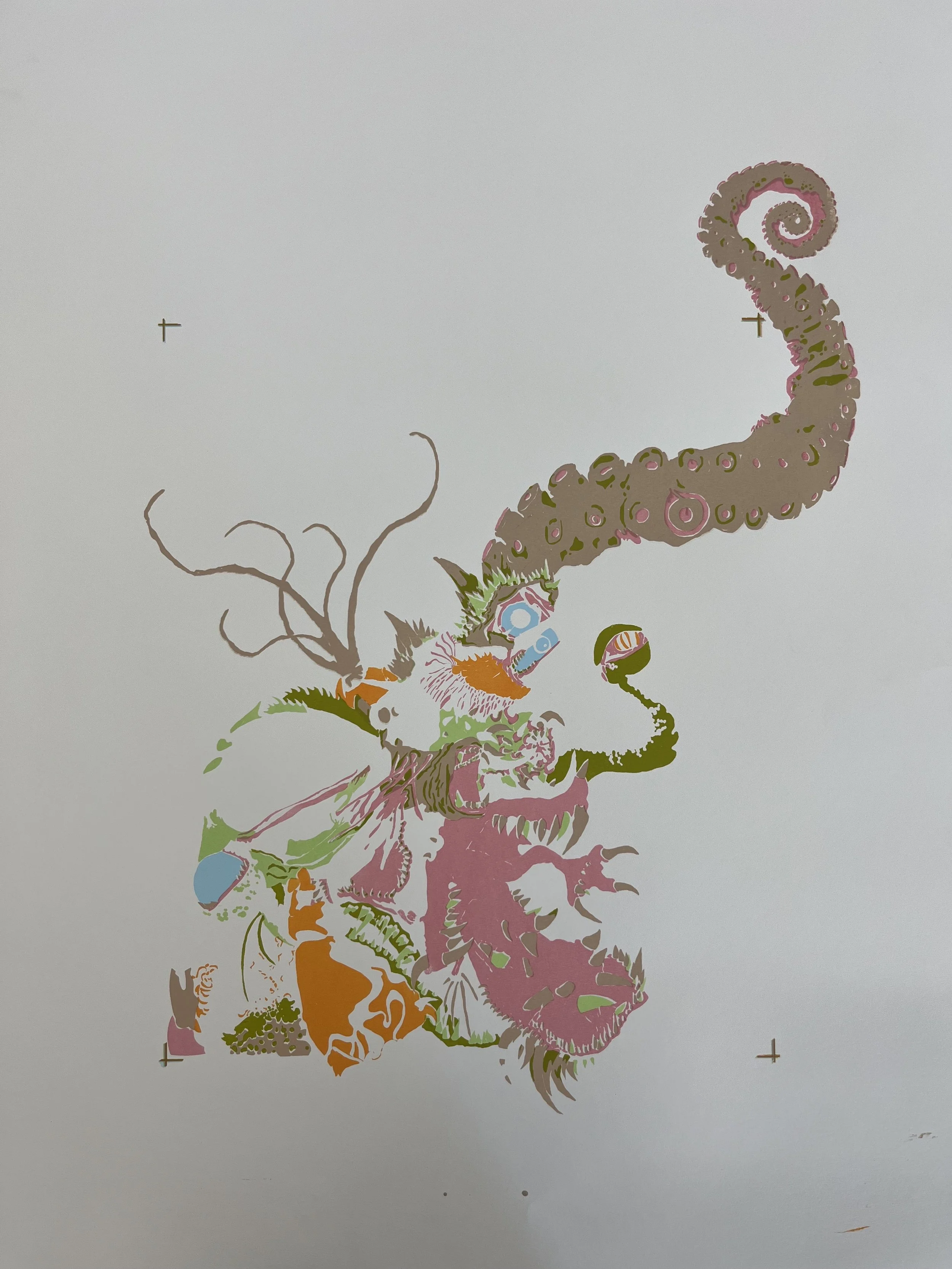
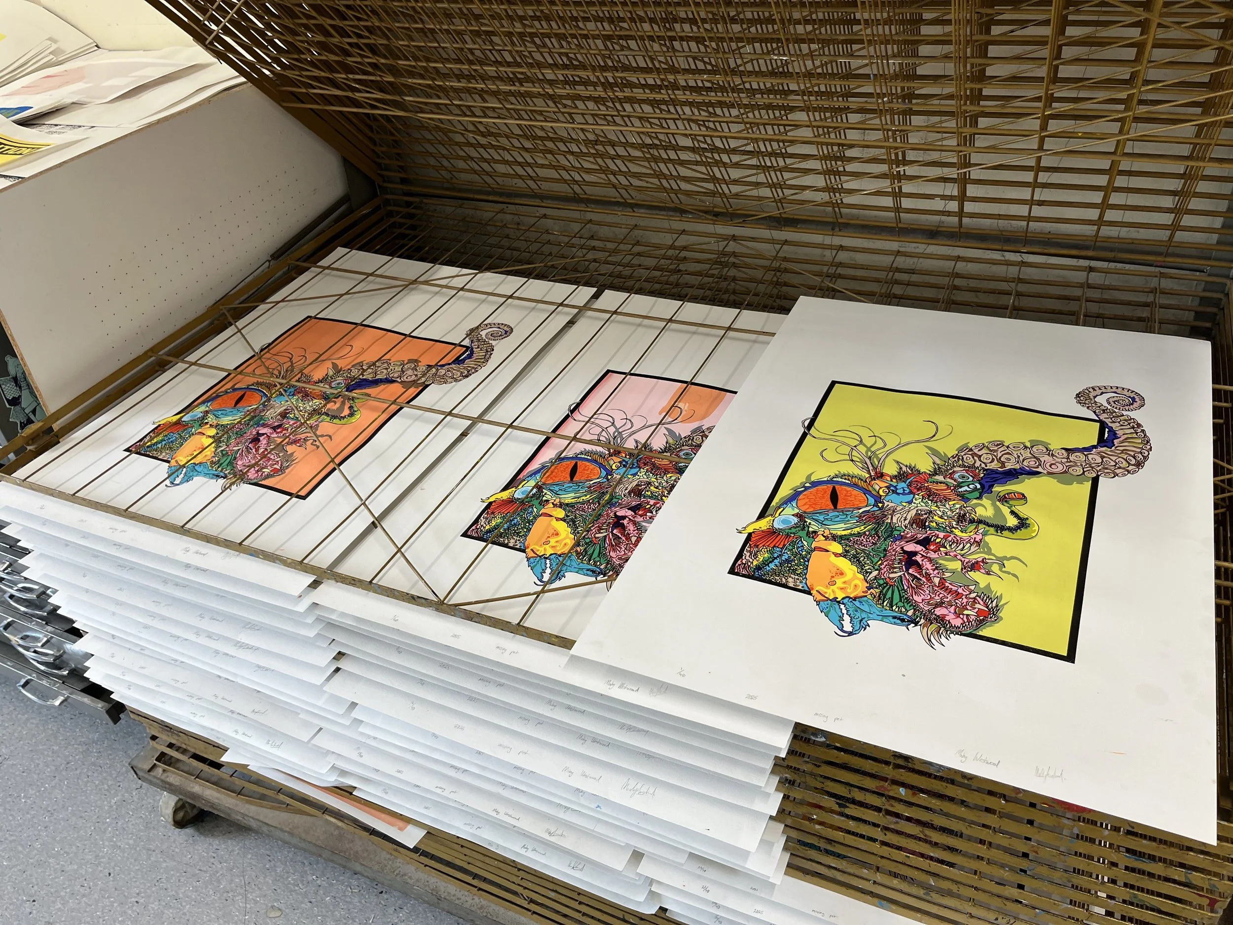
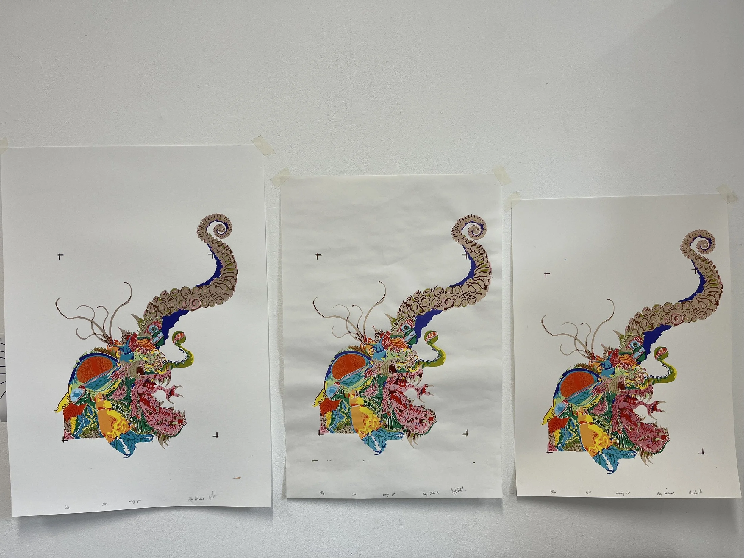
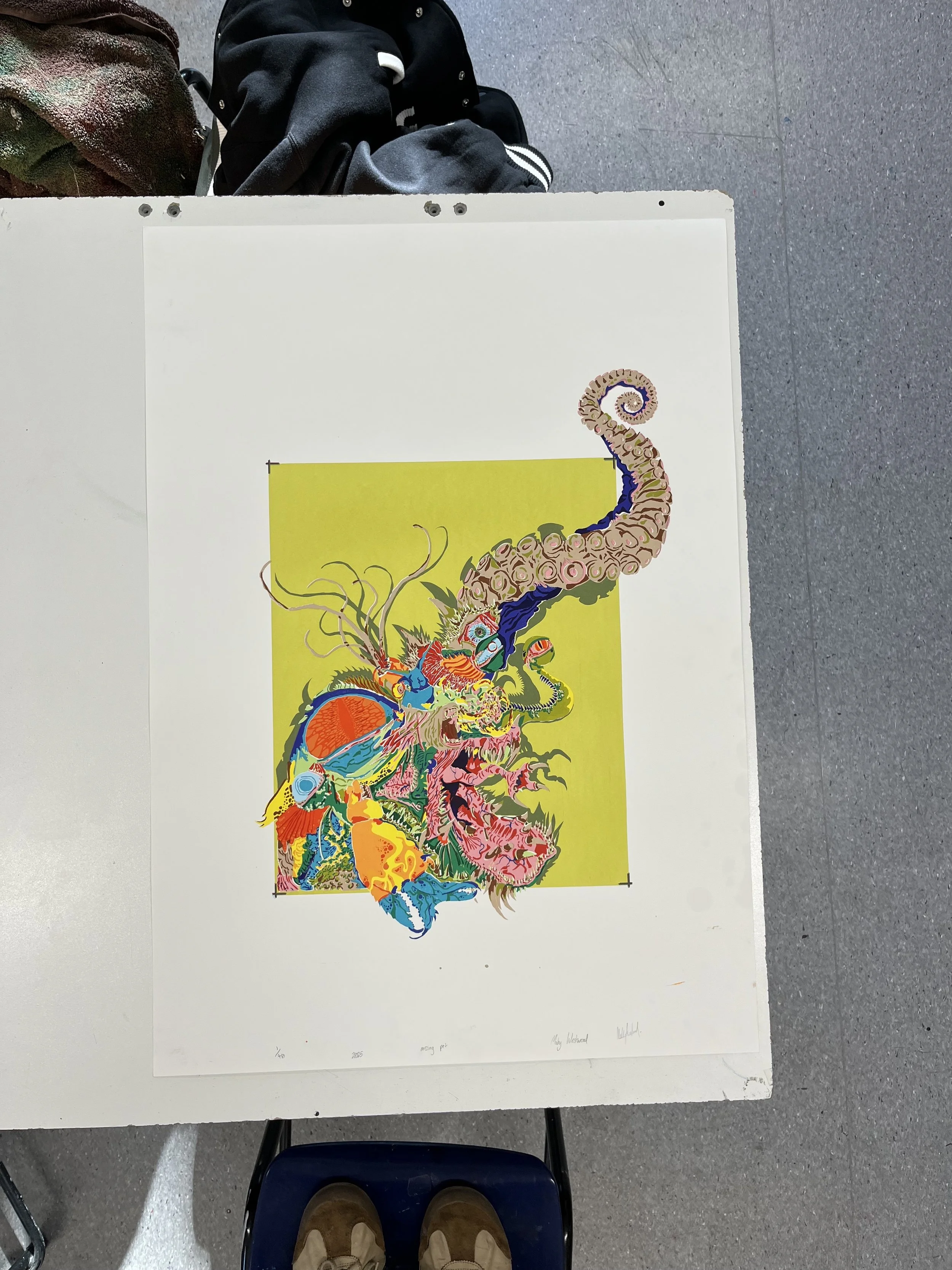
From there, I experimented with composition and text placement, producing digital drafts to test the balance between image and satirical tone. I created multiple transparencies for screen printing, which allowed me to layer colour, texture, and linework. Throughout the process, I tested a variety of ink colours, paper stocks, and registration methods to achieve a bold graphic finish with an intentionally offbeat texture.
Iteration played a central role in the project. I adjusted text and background colours to fine tune tone and rhythm across versions, treating each screenprint as an opportunity to refine layering techniques. This hands on process not only sharpened the final outcome but also became a way of exploring how satire functions visually, and how traditional printmaking can be stretched to carry absurd and contemporary commentary.
For a more detailed account of the screen printing method, including images, see the process section of Citizen Cane Toad, another of my print based projects.

Full Edition
If you would like to purchase one of these prints, please email me at moby@mobywestwood.com. The edition number, paper size, and availability are displayed below each print.

edition 1 (SOLD): 594mm x 841mm (A1)
edition 2 (SOLD): 594mm x 841mm (A1)
edition 3: 594mm x 841mm (A1)

edition 4: 594mm x 841mm (A1)
edition 5: 594mm x 841mm (A1)

edition 6 (SOLD): 594mm x 841mm (A1)

edition 7 (SOLD): 594mm x 841mm (A1)
edition 8 (SOLD): 594mm x 841mm (A1)

edition 9: 594mm x 841mm (A1)

edition 10 (SOLD): 594mm x 841mm (A1)

edition 11 (SOLD): 594mm x 841mm (A1)
edition 12: 594mm x 841mm (A1)
edition 13 (SOLD): 594mm x 841mm (A1)

edition 14 (SOLD): 594mm x 841mm (A1)

edition 15: 594mm x 841mm (A1)

edition 16 (SOLD): 594mm x 841mm (A1)

edition 17 (SOLD): 594mm x 841mm (A1)

edition 18 (SOLD): 594mm x 841mm (A1)
edition 19 (SOLD): 594mm x 841mm (A1)

edition 20 (SOLD): 594mm x 841mm (A1)
edition 21 (SOLD): 594mm x 841mm (A1)

edition 22: 594mm x 841mm (A1)
edition 23 (SOLD): 500mm x 700mm

edition 24 (SOLD): 500mm x 700mm
edition 25 (SOLD): 500mm x 700mm

edition 26 (SOLD): 500mm x 700mm

edition 27 (SOLD): 500mm x 700mm

edition 28: 500mm x 700mm

edition 29 (SOLD): 500mm x 700mm
edition 30: 500mm x 700mm

edition 31 (SOLD): 500mm x 700mm

edition 32 (SOLD): 500mm x 700mm

edition 33: 500mm x 700mm
edition 34 (SOLD): 500mm x 700mm