The ANBG Visual Identity
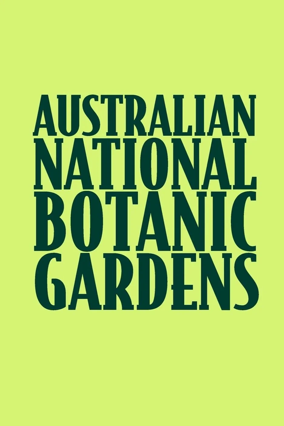
Client: The Australian National Botanic Gardens
Year: 2025

Project Breif
The Australian National Botanic Gardens is the only botanic garden in the world dedicated entirely to Australian native plants, a living archive of the nation’s botanical heritage. This project reimagines its visual identity to reflect the Gardens’ vibrant, diverse, and evolving character.
At the heart of the design is a dynamic identity system built from a library of stylised plant forms, from the bold Waratah to the delicate Lomandra, all drawn from species within the Gardens. Using generative code, these botanical shapes shift in position, rotation, and scale across applications, making every touchpoint feel unique, alive, and rooted in place.
The colour palette pairs rich greens and earthy neutrals with vivid floral tones such as Golden Wattle and Desert Pea, evoking the seasonal richness of Australian flora. Typography combines the elegance of Bodega Serif with the warmth and approachability of A Day Without Sun, creating a brand that is sophisticated yet welcoming.
The system extends across digital and physical platforms, from interactive web elements to on-site signage, including laser cut and full colour plant information plaques. Every interaction, online or in person, celebrates the beauty, diversity, and cultural significance of Australia’s native plants.

Process
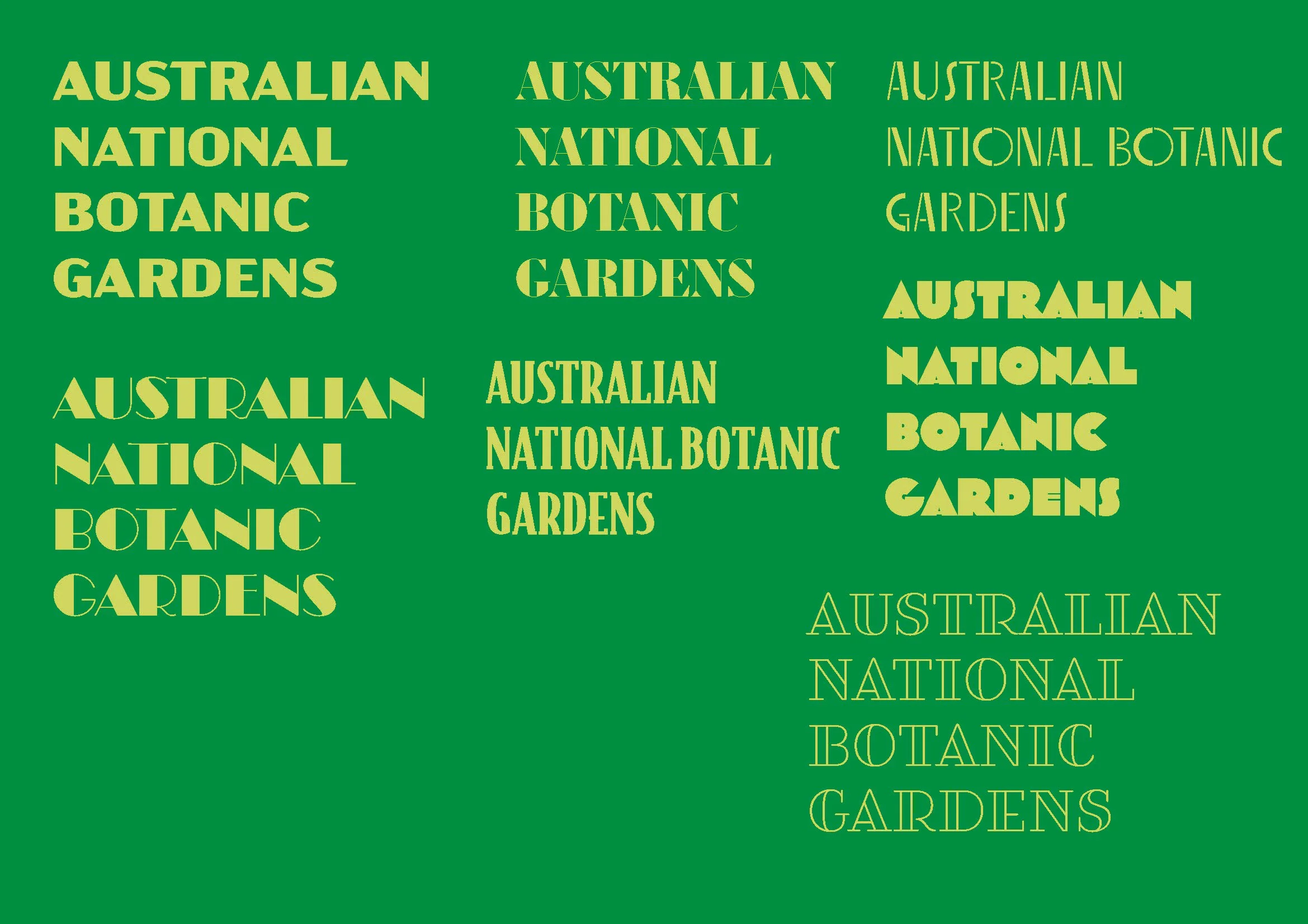
The ANBG dynamic identity began with typographic experiments paired with a single plant, the Golden Wattle, Australia’s floral emblem. Early designs combined type styling with the Wattle’s circular blooms, vibrant yellow tones, and symbolic role as a unifying, celebratory plant. Initial outputs included vector studies and mock ups for signage and print, exploring organic layering, bold colour, and the concept of an identity that feels alive and rooted in place.
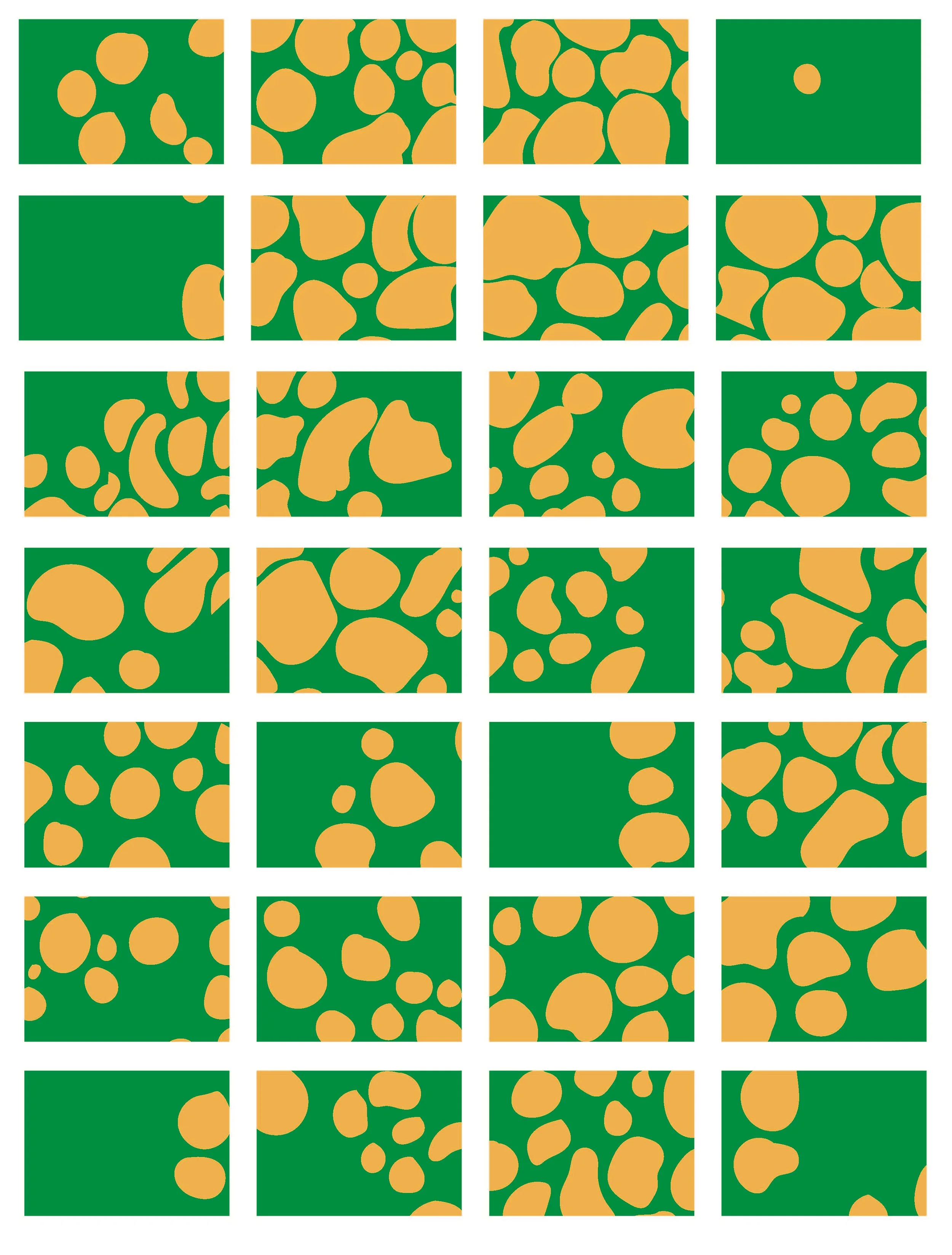
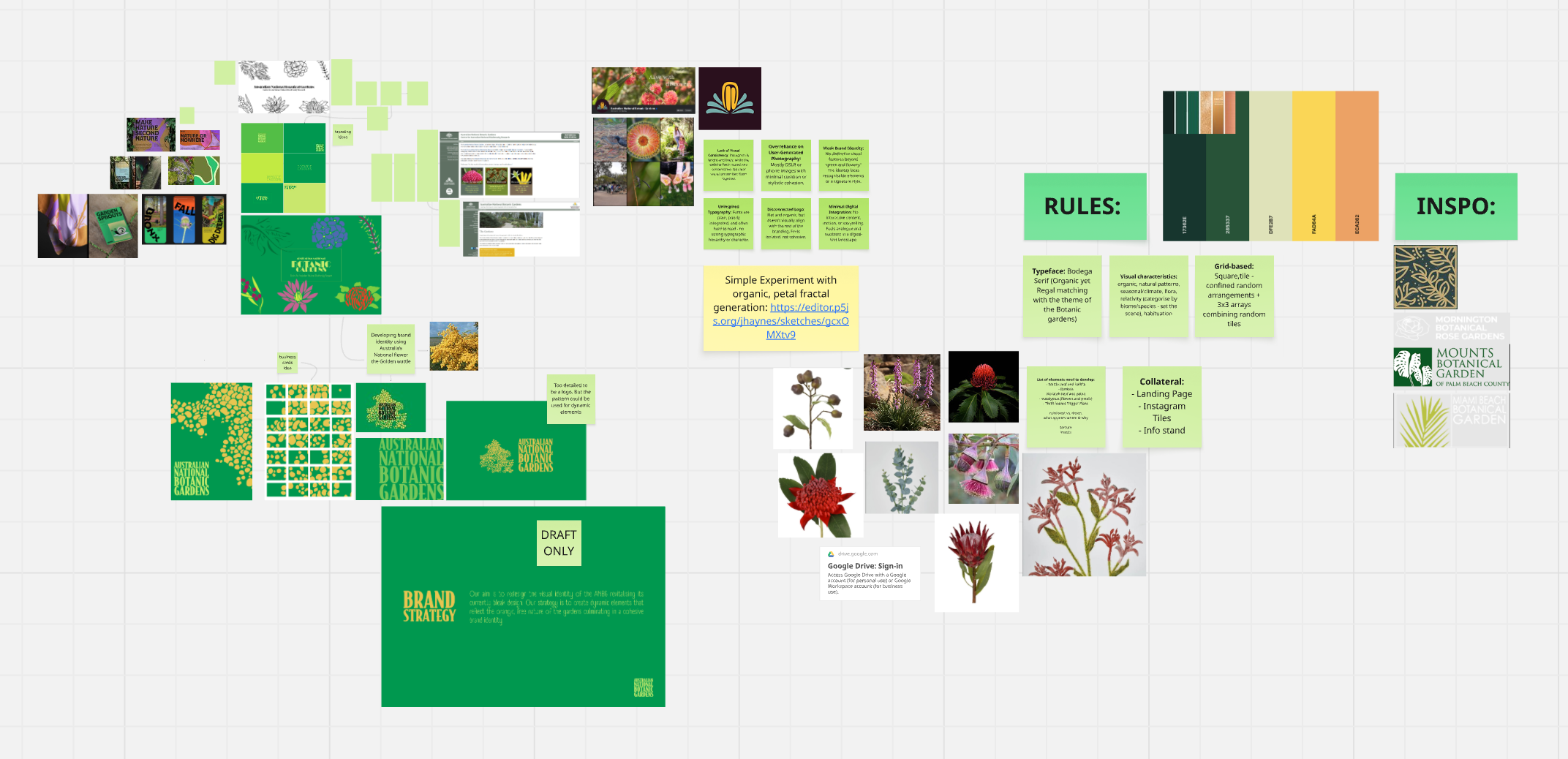
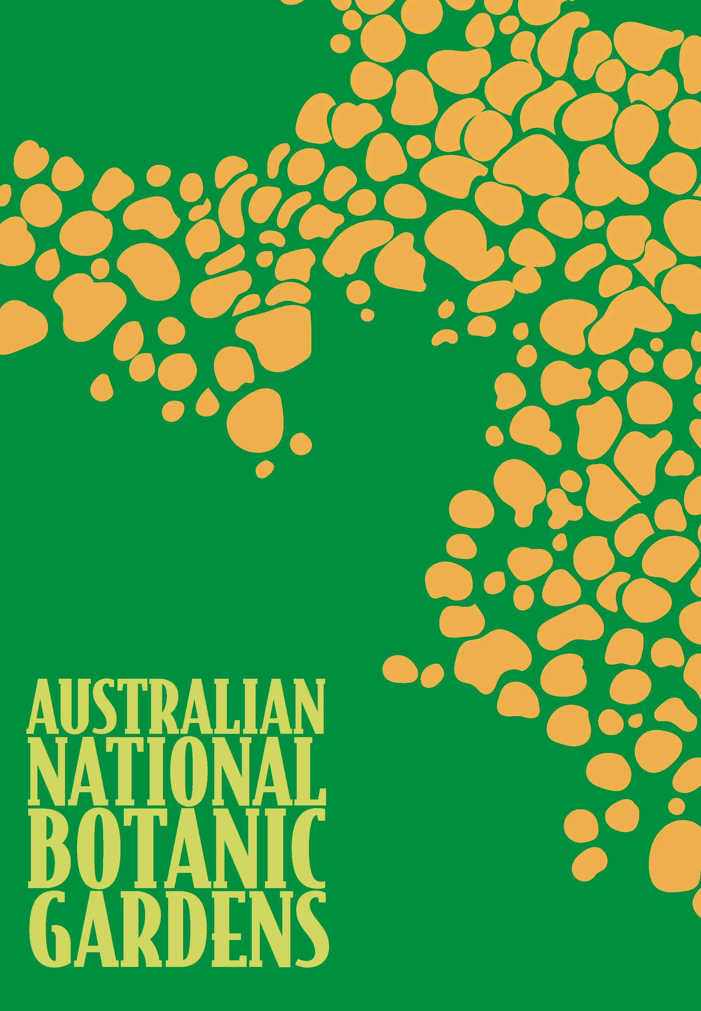
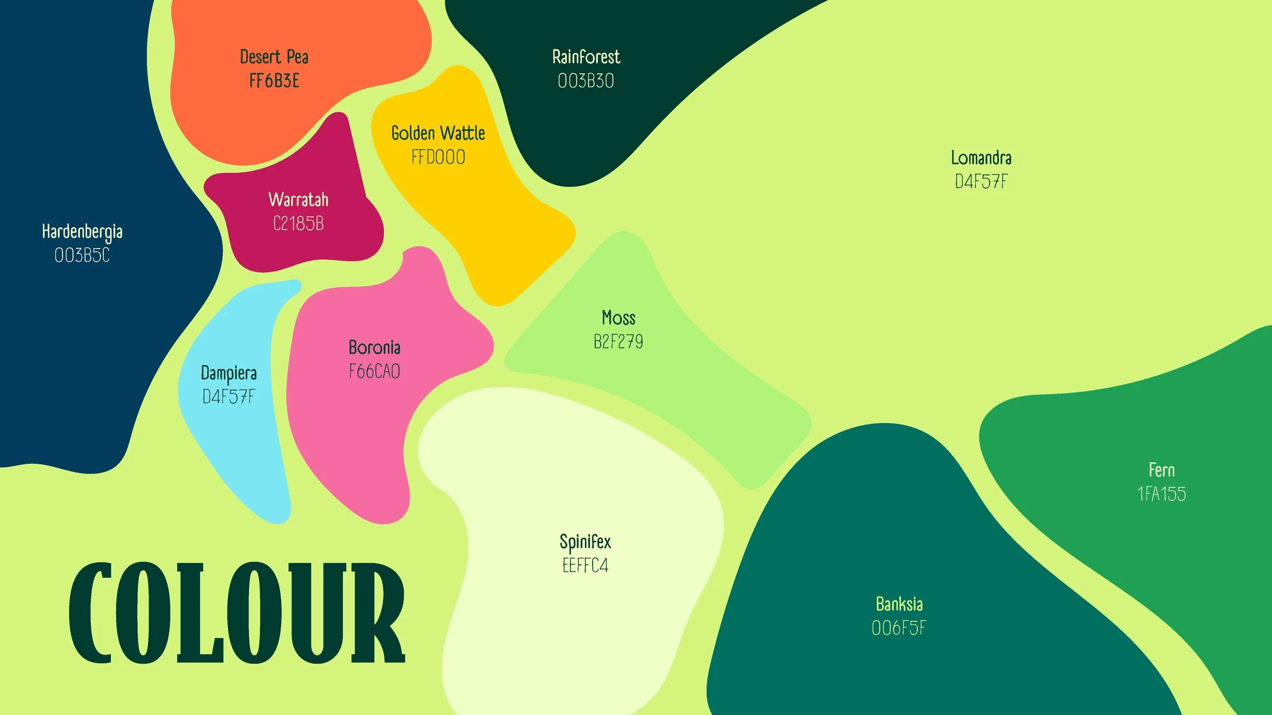
As the project evolved, it became clear that a single plant could not capture the ANBG’s botanical diversity. The Golden Wattle became the seed for a larger system: a curated library of stylised shapes from multiple native species. Each form was refined for clarity and cohesion, paired with a botanical colour palette designed for flexibility and contrast.

The colour matrix was created to ensure harmonious pairings across the dynamic identity, showing which botanical hues work together and adding separating strokes where contrast is low to maintain clarity and balance.

To bring the system to life, a generative p5.js framework randomly positioned, scaled, and rotated the shapes while ensuring colour harmony through the predefined matrix. This created endless variations without compromising legibility or balance. The identity was tested across digital interfaces and physical signage, including full colour and laser cut plaques. The result is a living visual system that evolves with every application, reflecting the richness and vitality of the Gardens.


Outcomes
The Outcomes of this project included a dynamic identity, a website landing page, social media assets, a series of informational plaques and a brand guidelines booklet.

Dynamic Identity:
The dynamic identity became the foundation of the project’s visual language, blending a curated library of stylised native plant forms with a botanical colour palette and generative placement system. This living framework made every application, from print to digital, feel unique yet cohesive, providing the creative and structural basis for the website, social media assets, and informational plaques.

The website landing page brought the dynamic identity to life with a generative header that shifted its botanical composition on each visit, adding freshness and movement. The layout used ANBG’s refined typography and colour palette to maintain brand consistency while guiding visitors effortlessly to key information such as events, visiting details, and educational resources.
Website Landing Page

Social Media Assets
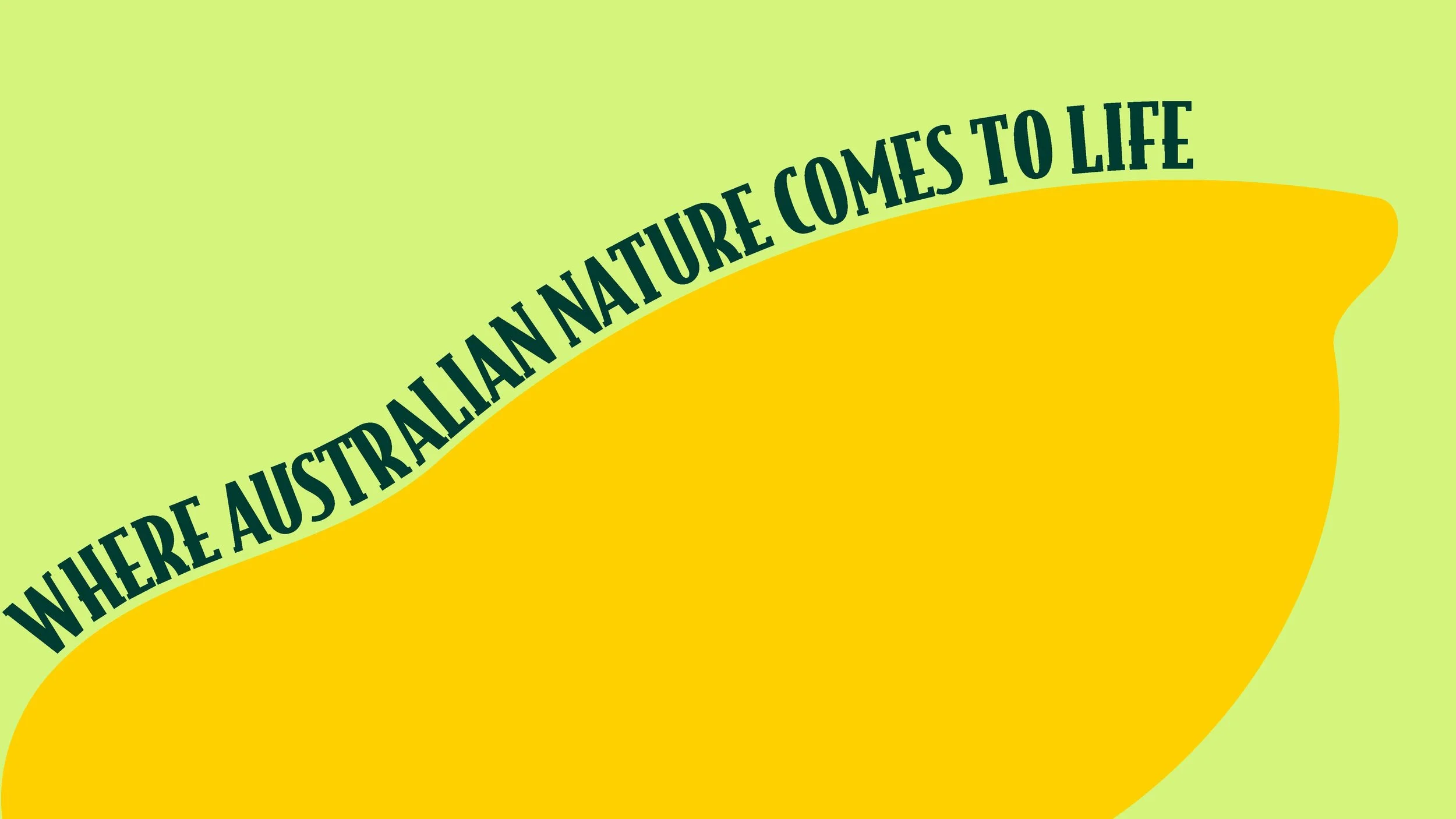
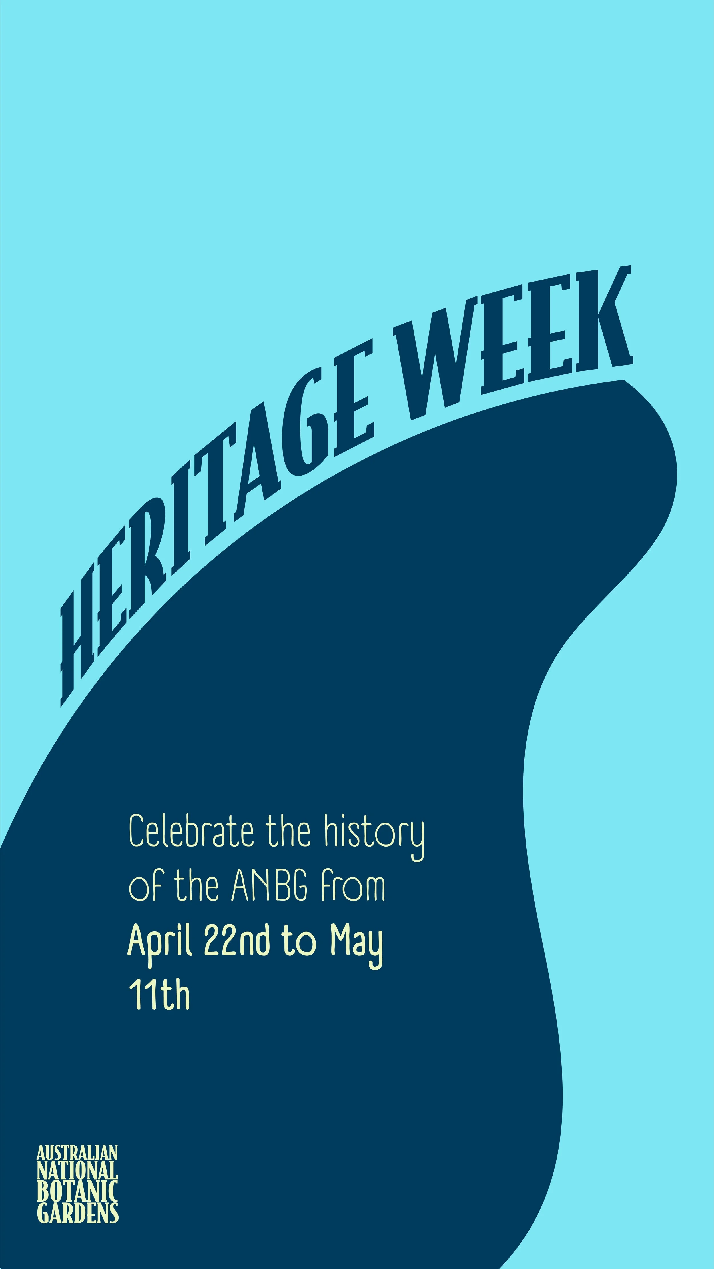
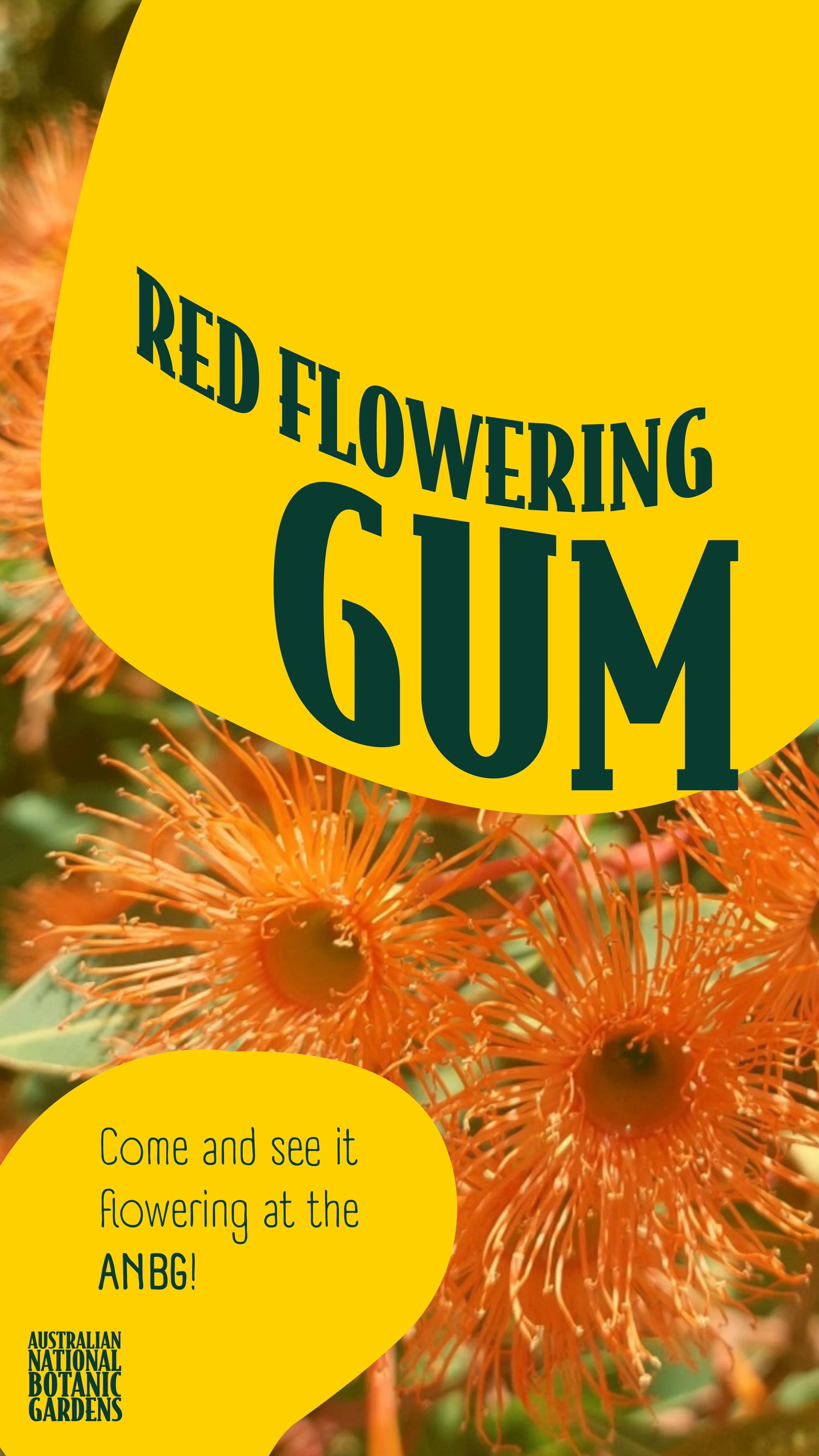
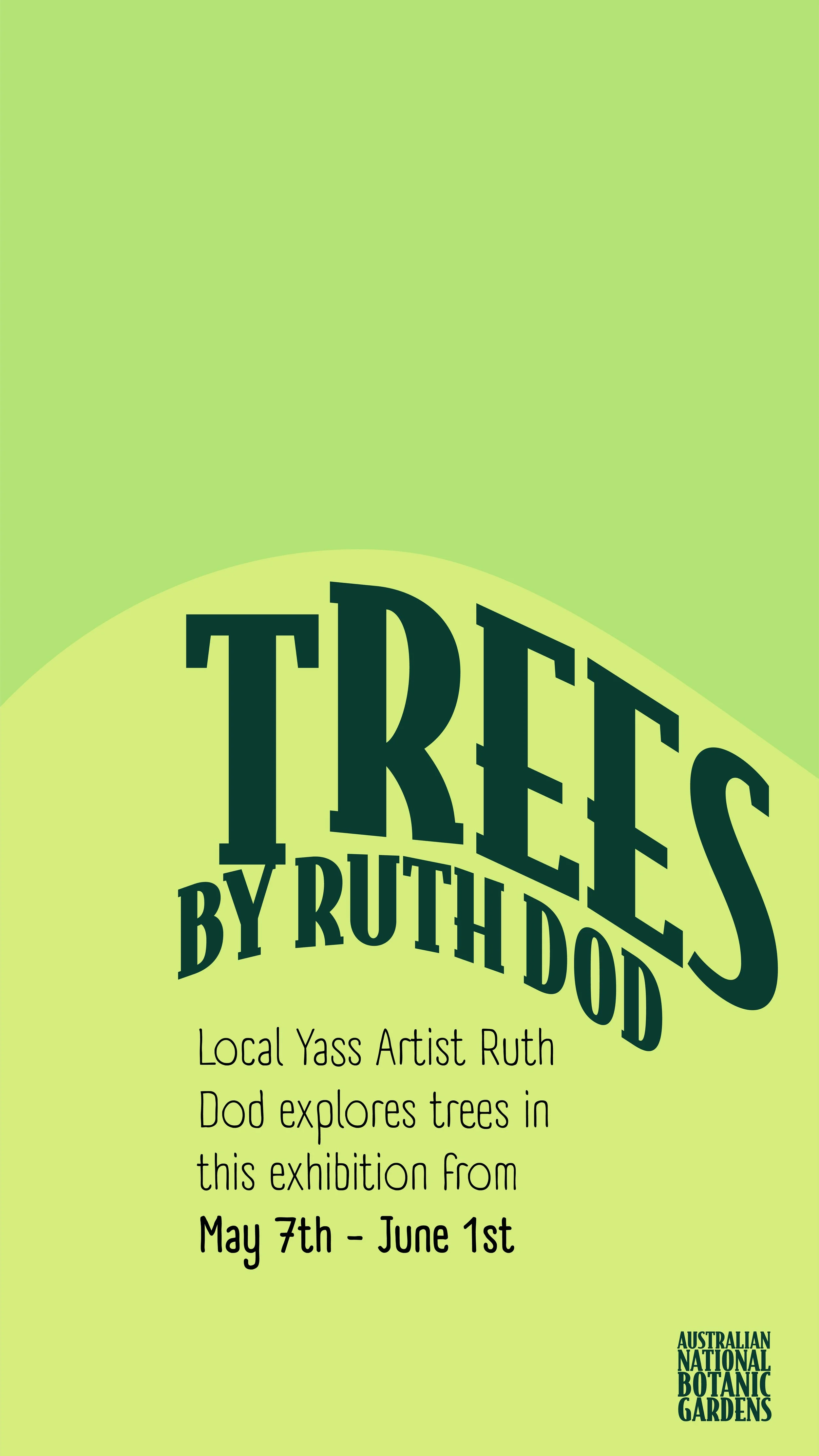
Social media assets used the dynamic identity to create striking, varied content, with each post featuring unique botanical compositions generated from the approved shape library and colour matrix. Headlines and key messages followed the contours of the vector plant forms, creating organic flow and movement that linked typography to the botanical elements. This approach maintained brand recognition while keeping the feed engaging and adaptable for campaigns, event promotion, and audience interaction across platforms.


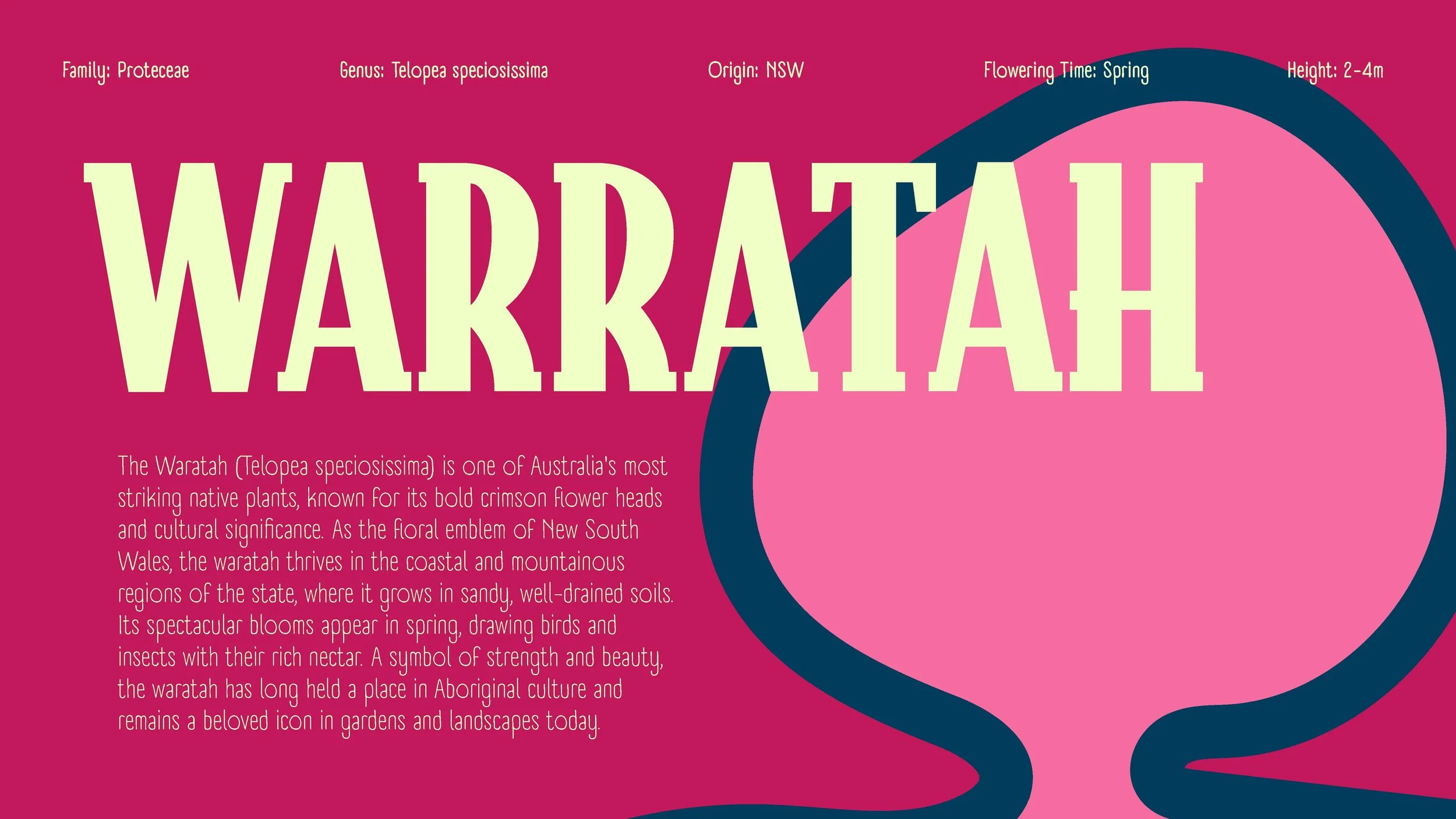
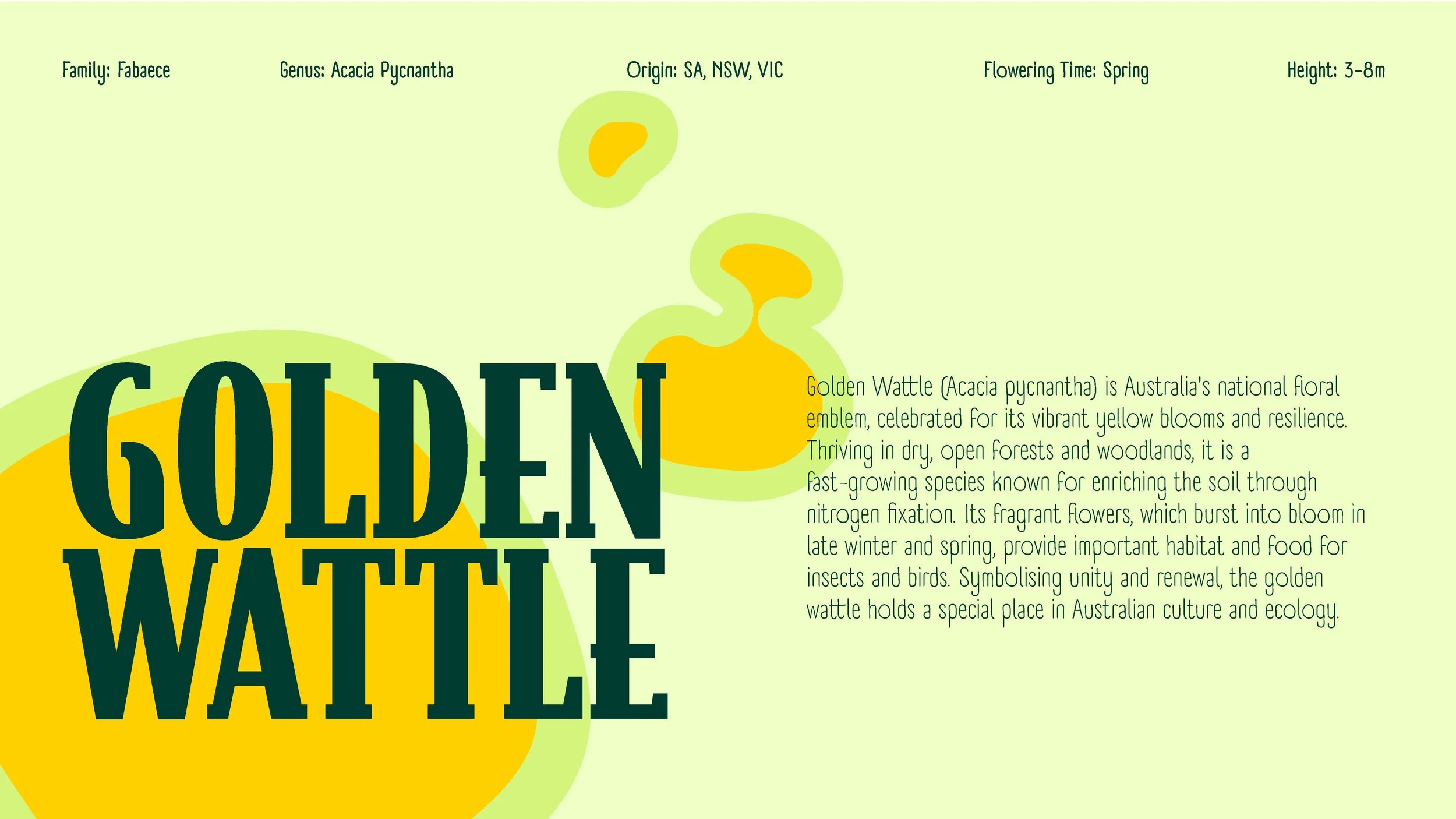
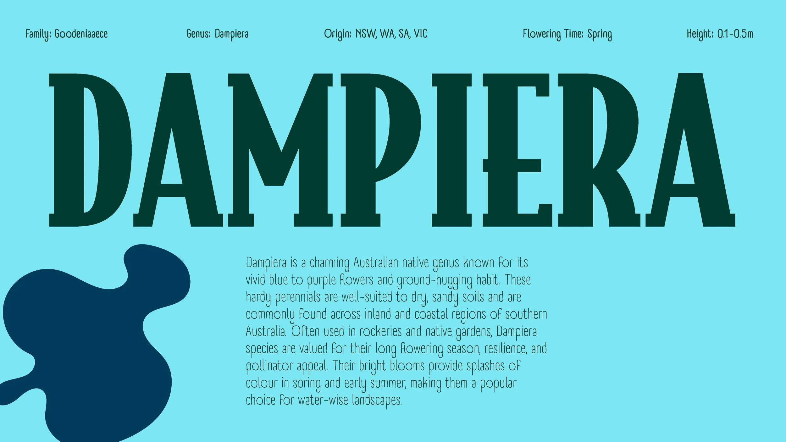
Information plaques
The informational plaques brought the dynamic identity into the physical world, combining vibrant botanical compositions with clear, accessible plant descriptions. Each plaque used species-specific colour combinations from the matrix, ensuring clarity and harmony, and some included laser-cut elements for added texture and tactility. Typography was designed for maximum legibility and consistency, letting the botanical graphics add visual energy while the text remained easy to read in outdoor settings.


Style Guide
The style guide defines the visual language of the ANBG dynamic identity, outlining its botanical colour palette, approved typefaces, shape library, and application rules. It ensures consistency across all brand touchpoints while allowing the generative system to produce unique, site specific compositions.
